textElement
Customizes the look and layout of text in a variety of ways.
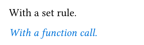
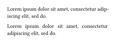
This function is used frequently, both with set rules and directly. While the set rule is often the simpler choice, calling the text function directly can be useful when passing text as an argument to another function.
Example
#set text(18pt)
With a set rule.
#emph(text(blue)[
With a function call.
])
Parameters
fontDefault: "libertinus serif"
A font family descriptor or priority list of font family descriptors.
A font family descriptor can be a plain string representing the family name or a dictionary with the following keys:
name(required): The font family name.covers(optional): Defines the Unicode codepoints for which the family shall be used. This can be:A predefined coverage set:
"latin-in-cjk"covers all codepoints except for those which exist in Latin fonts, but should preferably be taken from CJK fonts.
- A regular expression that defines exactly which codepoints shall be covered. Accepts only the subset of regular expressions which consist of exactly one dot, letter, or character class.
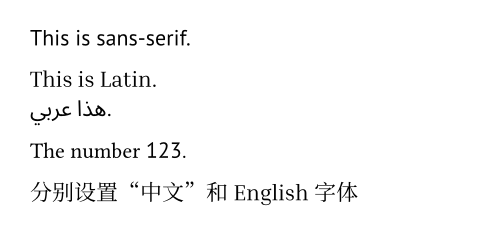
When processing text, Typst tries all specified font families in order until it finds a font that has the necessary glyphs. In the example below, the font Inria Serif is preferred, but since it does not contain Arabic glyphs, the arabic text uses Noto Sans Arabic instead.
Typst aims to unify different fonts from the same family under a single family name. To that effect, it automatically trims common style suffixes like “Bold” or “Condensed” from font family names. Instead of selecting these through the name, access them through Typst’s built-in mechanisms (such as the weight and stretch parameters). Similarly, when using a variable font with Typst, the suffixes “Variable”, “Var”, and “VF” should be omitted as Typst trims them to unify static and variable fonts into a single family.
Between fonts from the same family, Typst picks the one that is the closest match to the configured text style, weight, and stretch. If both a static and a variable font support a specific configuration, the variable font is preferred.
The collection of available fonts differs by platform:
In the web app, you can see the list of available fonts by clicking on the “Ag” button. You can provide additional fonts by uploading
.ttfor.otffiles into your project. They will be discovered automatically. The priority is: project fonts > server fonts.Locally, Typst uses your installed system fonts or embedded fonts in the CLI, which are
Libertinus Serif,New Computer Modern,New Computer Modern Math, andDejaVu Sans Mono. In addition, you can use the--font-pathargument orTYPST_FONT_PATHSenvironment variable to add directories that should be scanned for fonts. The priority is:--font-path> system fonts > embedded fonts. Runtypst fontsto see the fonts that Typst has discovered on your system. Note that you can pass the--ignore-system-fontsparameter to the CLI to ensure Typst won’t search for system fonts.
 View example
#set text(font: "PT Sans")
This is sans-serif.
#set text(font: (
"Inria Serif",
"Noto Sans Arabic",
))
This is Latin. \
هذا عربي.
// Change font only for numbers.
#set text(font: (
(name: "PT Sans", covers: regex("[0-9]")),
"Libertinus Serif"
))
The number 123.
// Mix Latin and CJK fonts.
#set text(font: (
(name: "Inria Serif", covers: "latin-in-cjk"),
"Noto Serif CJK SC"
))
分别设置“中文”和English字体
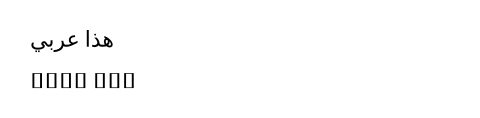
fallbackDefault: true
Whether to allow last resort font fallback when the primary font list contains no match. This lets Typst search through all available fonts for the most similar one that has the necessary glyphs.
Note: Currently, there are no warnings when fallback is disabled and no glyphs are found. Instead, your text shows up in the form of “tofus”: Small boxes that indicate the lack of an appropriate glyph. In the future, you will be able to instruct Typst to issue warnings so you know something is up.
View example
#set text(font: "Inria Serif")
هذا عربي
#set text(fallback: false)
هذا عربي
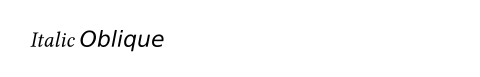
styleDefault: "normal"
The desired font style.
When an italic style is requested and only an oblique one is available, it is used. Similarly, the other way around, an italic style can stand in for an oblique one. When neither an italic nor an oblique style is available, Typst selects the normal style. Since most fonts are only available either in an italic or oblique style, the difference between italic and oblique style is rarely observable.
When used with a suitable variable font, Typst will automatically configure the ital (for an italic style) or slnt (for an oblique style) font variation based on this property.
Note: If you want to emphasize your text, you should do so using the emph function instead. This makes it easy to adapt the style later if you change your mind about how to signify the emphasis.
View example
#text(font: "Libertinus Serif", style: "italic")[Italic]
#text(font: "DejaVu Sans", style: "oblique")[Oblique]
| Variant | Details |
|---|---|
"normal" | The default, typically upright style. |
"italic" | A cursive style with custom letterform. |
"oblique" | Just a slanted version of the normal style. |
weightDefault: "regular"
The desired thickness of the font’s glyphs. Accepts an integer between 100 and 900 or one of the predefined weight names. When the desired weight is not available, Typst selects the font from the family that is closest in weight.
When used with a suitable variable font, Typst will automatically configure the wght font variation based on this property.
Note: If you want to strongly emphasize your text, you should do so using the strong function instead. This makes it easy to adapt the style later if you change your mind about how to signify the strong emphasis.
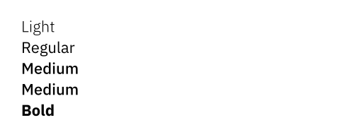
View example
#set text(font: "IBM Plex Sans")
#text(weight: "light")[Light] \
#text(weight: "regular")[Regular] \
#text(weight: "medium")[Medium] \
#text(weight: 500)[Medium] \
#text(weight: "bold")[Bold]
| Variant | Details |
|---|---|
"thin" | Thin weight (100). |
"extralight" | Extra light weight (200). |
"light" | Light weight (300). |
"regular" | Regular weight (400). |
"medium" | Medium weight (500). |
"semibold" | Semibold weight (600). |
"bold" | Bold weight (700). |
"extrabold" | Extrabold weight (800). |
"black" | Black weight (900). |
stretchDefault: 100%
The desired width of the glyphs. Accepts a ratio between 50% and 200%. When the desired width is not available, Typst selects the font from the family that is closest in stretch. This will only stretch the text if a condensed or expanded version of the font is available.
When used with a suitable variable font, Typst will automatically configure the wdth font variation based on this property.
If you want to adjust the amount of space between characters instead of stretching the glyphs itself, use the tracking property instead.
View example
#set text(font: "IBM Plex Sans")
#text(stretch: 75%)[Condensed] \
#text(stretch: 100%)[Normal]

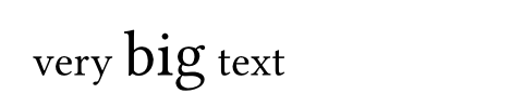
sizeDefault: 11pt
The size of the glyphs. This value forms the basis of the em unit: 1em is equivalent to the font size.
You can also give the font size itself in em units. Then, it is relative to the previous font size.
When used with a suitable variable font, Typst will automatically configure the opsz (optical size) font variation based on this property, optimizing legibility for the specific size.
View example
#set text(size: 20pt)
very #text(1.5em)[big] text
fillDefault: luma(0%)
The glyph fill paint.
View example
#set text(fill: red)
This text is red.

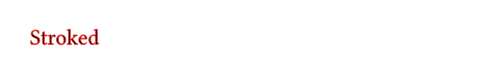
strokeDefault: none
How to stroke the text.
View example
#text(stroke: 0.5pt + red)[Stroked]
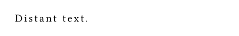
trackingDefault: 0pt
The amount of space that should be added between characters.
View example
#set text(tracking: 1.5pt)
Distant text.
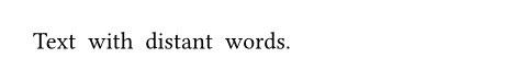
spacingDefault: 100% + 0pt
The amount of space between words.
Can be given as an absolute length, but also relative to the width of the space character in the font.
If you want to adjust the amount of space between characters rather than words, use the tracking property instead.
View example
#set text(spacing: 200%)
Text with distant words.
cjk-latin-spacingDefault: auto
Whether to automatically insert spacing between CJK and Latin characters.
View example
#set text(cjk-latin-spacing: auto)
第4章介绍了基本的API。
#set text(cjk-latin-spacing: none)
第4章介绍了基本的API。

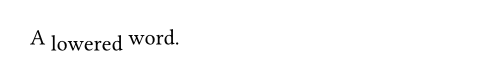
baselineDefault: 0pt
An amount to shift the text baseline by.
View example
A #text(baseline: 3pt)[lowered]
word.
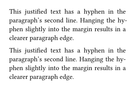
overhangDefault: true
Whether certain glyphs can hang over into the margin in justified text. This can make justification visually more pleasing.
View example
#set page(width: 220pt)
#set par(justify: true)
This justified text has a hyphen in
the paragraph's second line. Hanging
the hyphen slightly into the margin
results in a clearer paragraph edge.
#set text(overhang: false)
This justified text has a hyphen in
the paragraph's second line. Hanging
the hyphen slightly into the margin
results in a clearer paragraph edge.
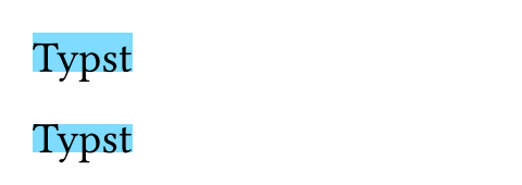
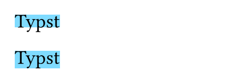
top-edgeDefault: "cap-height"
The top end of the conceptual frame around the text used for layout and positioning. This affects the size of containers that hold text.
View example
#set rect(inset: 0pt)
#set text(size: 20pt)
#set text(top-edge: "ascender")
#rect(fill: aqua)[Typst]
#set text(top-edge: "cap-height")
#rect(fill: aqua)[Typst]
| Variant | Details |
|---|---|
"ascender" | The font’s ascender, which typically exceeds the height of all glyphs. |
"cap-height" | The approximate height of uppercase letters. |
"x-height" | The approximate height of non-ascending lowercase letters. |
"baseline" | The baseline on which the letters rest. |
"bounds" | The top edge of the glyph’s bounding box. |
bottom-edgeDefault: "baseline"
The bottom end of the conceptual frame around the text used for layout and positioning. This affects the size of containers that hold text.
View example
#set rect(inset: 0pt)
#set text(size: 20pt)
#set text(bottom-edge: "baseline")
#rect(fill: aqua)[Typst]
#set text(bottom-edge: "descender")
#rect(fill: aqua)[Typst]
| Variant | Details |
|---|---|
"baseline" | The baseline on which the letters rest. |
"descender" | The font’s descender, which typically exceeds the depth of all glyphs. |
"bounds" | The bottom edge of the glyph’s bounding box. |
langDefault: "en"
An ISO 639-1/2/3 language code.
Setting the correct language affects various parts of Typst:
- The text processing pipeline can make more informed choices.
- Hyphenation will use the correct patterns for the language.
- Smart quotes turns into the correct quotes for the language.
- And all other things which are language-aware.
Choosing the correct language is important for accessibility. For example, screen readers will use it to choose a voice that matches the language of the text. If your document is in another language than English (the default), you should set the text language at the start of your document, before any other content. You can, for example, put it right after the #set document(/* ... */) rule that sets your document’s title.
If your document contains passages in a different language than the main language, you should locally change the text language just for those parts, either with a set rule scoped to a block or using a direct text function call such as #text(lang: "de")[...].
If multiple codes are available for your language, you should prefer the two-letter code (ISO 639-1) over the three-letter codes (ISO 639-2/3). When you have to use a three-letter code and your language differs between ISO 639-2 and ISO 639-3, use ISO 639-2 for PDF 1.7 (Typst’s default for PDF export) and below and ISO 639-3 for PDF 2.0 and HTML export.
The language code is case-insensitive, and will be lowercased when accessed through context.
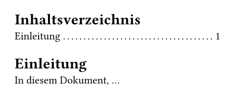
View example: Setting the text language to German
#set text(lang: "de")
#outline()
= Einleitung
In diesem Dokument, ...
regionDefault: none
An ISO 3166-1 alpha-2 region code.
This lets the text processing pipeline make more informed choices.
The region code is case-insensitive, and will be uppercased when accessed through context.
scriptDefault: auto
The OpenType writing script.
The combination of lang and script determine how font features, such as glyph substitution, are implemented. Frequently the value is a modified (all-lowercase) ISO 15924 script identifier, and the math writing script is used for features appropriate for mathematical symbols.
When set to auto, the default and recommended setting, an appropriate script is chosen for each block of characters sharing a common Unicode script property.
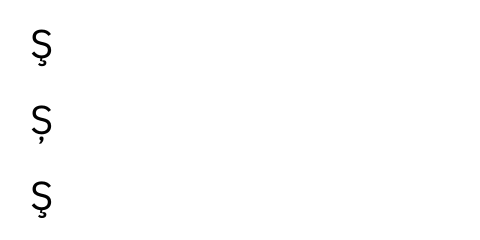
View example
#set text(
font: "IBM Plex Sans",
size: 20pt,
)
#let scedilla = [Ş]
#scedilla // S with a cedilla
#set text(lang: "ro", script: "latn")
#scedilla // S with a subscript comma
#set text(lang: "ro", script: "grek")
#scedilla // S with a cedilla
dirDefault: auto
The dominant direction for text and inline objects. Possible values are:
auto: Automatically infer the direction from thelangproperty.ltr: Layout text from left to right.rtl: Layout text from right to left.
When writing in right-to-left scripts like Arabic or Hebrew, you should set the text language or direction. While individual runs of text are automatically layouted in the correct direction, setting the dominant direction gives the bidirectional reordering algorithm the necessary information to correctly place punctuation and inline objects. Furthermore, setting the direction affects the alignment values start and end, which are equivalent to left and right in ltr text and the other way around in rtl text.
If you set this to rtl and experience bugs or in some way bad looking output, please get in touch with us through the Forum, Discord server, or our contact form.
View example
#set text(dir: rtl)
هذا عربي.

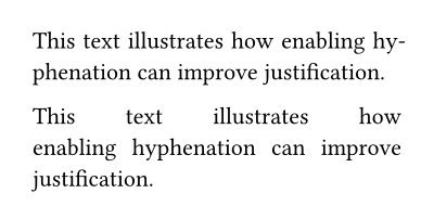
hyphenateDefault: auto
Whether to hyphenate text to improve line breaking. When auto, text will be hyphenated if and only if justification is enabled.
Setting the text language ensures that the correct hyphenation patterns are used.
View example
#set page(width: 200pt)
#set par(justify: true)
This text illustrates how
enabling hyphenation can
improve justification.
#set text(hyphenate: false)
This text illustrates how
enabling hyphenation can
improve justification.
costsDefault: (
hyphenation: 100%,
runt: 100%,
widow: 100%,
orphan: 100%,
)
hyphenation: 100%,
runt: 100%,
widow: 100%,
orphan: 100%,
)
The “cost” of various choices when laying out text. A higher cost means the layout engine will make the choice less often. Costs are specified as a ratio of the default cost, so 50% will make text layout twice as eager to make a given choice, while 200% will make it half as eager.
Currently, the following costs can be customized:
hyphenation: splitting a word across multiple linesrunt: ending a paragraph with a line with a single wordwidow: leaving a single line of paragraph on the next pageorphan: leaving single line of paragraph on the previous page
Hyphenation is generally avoided by placing the whole word on the next line, so a higher hyphenation cost can result in awkward justification spacing. Note: Hyphenation costs will only be applied when the linebreaks are set to “optimized”. (For example by default implied by justify.)
Runts are avoided by placing more or fewer words on previous lines, so a higher runt cost can result in more awkward in justification spacing.
Text layout prevents widows and orphans by default because they are generally discouraged by style guides. However, in some contexts they are allowed because the prevention method, which moves a line to the next page, can result in an uneven number of lines between pages. The widow and orphan costs allow disabling these modifications. (Currently, 0% allows widows/orphans; anything else, including the default of 100%, prevents them. More nuanced cost specification for these modifications is planned for the future.)
View example
#set text(hyphenate: true, size: 11.4pt)
#set par(justify: true)
#lorem(10)
// Set hyphenation to ten times the normal cost.
#set text(costs: (hyphenation: 1000%))
#lorem(10)
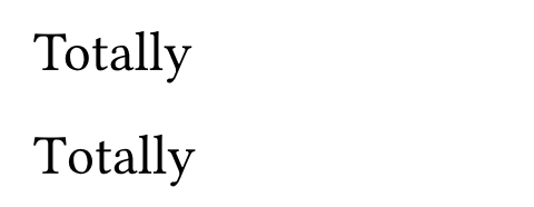
kerningDefault: true
Whether to apply kerning.
When enabled, specific letter pairings move closer together or further apart for a more visually pleasing result. The example below demonstrates how decreasing the gap between the “T” and “o” results in a more natural look. Setting this to false disables kerning by turning off the OpenType kern font feature.
View example
#set text(size: 25pt)
Totally
#set text(kerning: false)
Totally
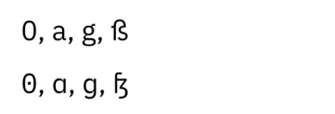
alternatesDefault: 0
Whether to apply stylistic alternates.
Sometimes fonts contain alternative glyphs for the same codepoint. Setting this to true switches to these by enabling the OpenType salt font feature. An integer may be used to select between multiple alternates.
View example
#set text(
font: "IBM Plex Sans",
size: 20pt,
)
0, a, g, ß
#set text(alternates: true)
0, a, g, ß
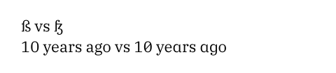
stylistic-setDefault: ()
Which stylistic sets to apply. Font designers can categorize alternative glyphs forms into stylistic sets. As this value is highly font-specific, you need to consult your font to know which sets are available.
This can be set to an integer or an array of integers, all of which must be between 1 and 20, enabling the corresponding OpenType feature(s) from ss01 to ss20. Setting this to none will disable all stylistic sets.
View example
#set text(font: "IBM Plex Serif")
ß vs #text(stylistic-set: 5)[ß] \
10 years ago vs #text(stylistic-set: (1, 2, 3))[10 years ago]
ligaturesDefault: true
Whether standard ligatures are active.
Certain letter combinations like “fi” are often displayed as a single merged glyph called a ligature. Setting this to false disables these ligatures by turning off the OpenType liga and clig font features.
View example
#set text(size: 20pt)
A fine ligature.
#set text(ligatures: false)
A fine ligature.
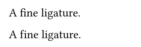
Note that some programming fonts use other OpenType font features to implement “ligatures,” including the contextual alternates (calt) feature, which is also enabled by default. Use the general features parameter to control such features.
discretionary-ligaturesDefault: false
Whether ligatures that should be used sparingly are active. Setting this to true enables the OpenType dlig font feature.
historical-ligaturesDefault: false
Whether historical ligatures are active. Setting this to true enables the OpenType hlig font feature.
number-typeDefault: auto
Which kind of numbers / figures to select. When set to auto, the default numbers for the font are used.
View example
#set text(font: "Noto Sans", 20pt)
#set text(number-type: "lining")
Number 9.
#set text(number-type: "old-style")
Number 9.
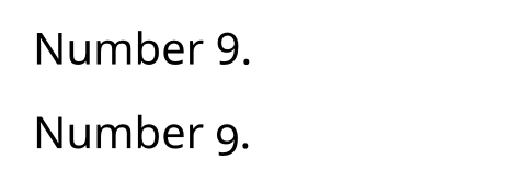
| Variant | Details |
|---|---|
"lining" | Numbers that fit well with capital text (the OpenType lnum font feature). |
"old-style" | Numbers that fit well into a flow of upper- and lowercase text (the OpenType onum font feature). |
number-widthDefault: auto
The width of numbers / figures. When set to auto, the default numbers for the font are used.
View example
#set text(font: "Noto Sans", 20pt)
#set text(number-width: "proportional")
A 12 B 34. \
A 56 B 78.
#set text(number-width: "tabular")
A 12 B 34. \
A 56 B 78.
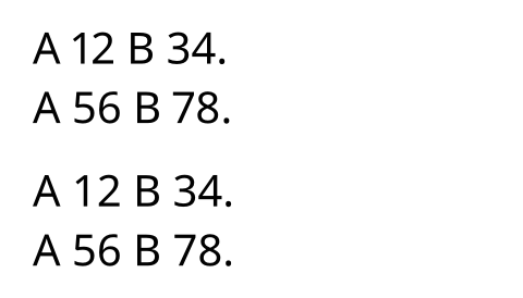
| Variant | Details |
|---|---|
"proportional" | Numbers with glyph-specific widths (the OpenType pnum font feature). |
"tabular" | Numbers of equal width (the OpenType tnum font feature). |
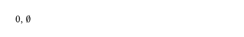
slashed-zeroDefault: false
Whether to have a slash through the zero glyph. Setting this to true enables the OpenType zero font feature.
View example
0, #text(slashed-zero: true)[0]
fractionsDefault: false
Whether to turn numbers into fractions. Setting this to true enables the OpenType frac font feature.
It is not advisable to enable this property globally as it will mess with all appearances of numbers after a slash (e.g., in URLs). Instead, enable it locally when you want a fraction.
View example
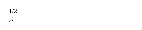
1/2 \
#text(fractions: true)[1/2]
featuresDefault: (:)
Raw OpenType features to apply.
- If given an array of strings, sets the features identified by the strings to
1. - If given a dictionary mapping to numbers, sets the features identified by the keys to the values. This allows interacting with non-boolean features such as
swsh.
View example: Give an array of strings
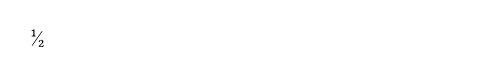
// Enable the `frac` feature manually.
#set text(features: ("frac",))
1/2
View example: Give a dictionary mapping to numbers
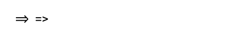
#set text(font: "Cascadia Code")
=>
// Disable the contextual alternates (`calt`) feature.
#set text(features: (calt: 0))
=>
variationsDefault: (:)
Raw OpenType font variations to apply.
While classic static fonts require a separate font file for each style combination, variable fonts have variation axes from which many different styles can be instanced. Variation axes are identified by case-sensitive four-letter strings.
There are a few well-known variation axes, for which Typst will automatically set suitable values based on the text weight, stretch, style, and size. This includes:
wght: Weight (e.g., 400 for regular, 700 for bold)wdth: Width (percentage, e.g., 100 for normal)slnt: Slant (degrees, negative for right-leaning)ital: Italic (0 for upright, 1 for italic)opsz: Optical size (in points)
Fonts can also define custom variation axes to realize arbitrary visual effects. For example, a font’s appearance could become more whimsical the higher a particular axis value is set.
With the variations parameter, you can directly set values for the axes supported by the active font. It only has an effect when used with a suitable variable font that supports the specified axes. You can use the parameter both to override automatically set values for the well-known axes and to set values for custom axes.
The value should be a dictionary mapping axis tags (four-character strings) to their values (floating-point numbers).
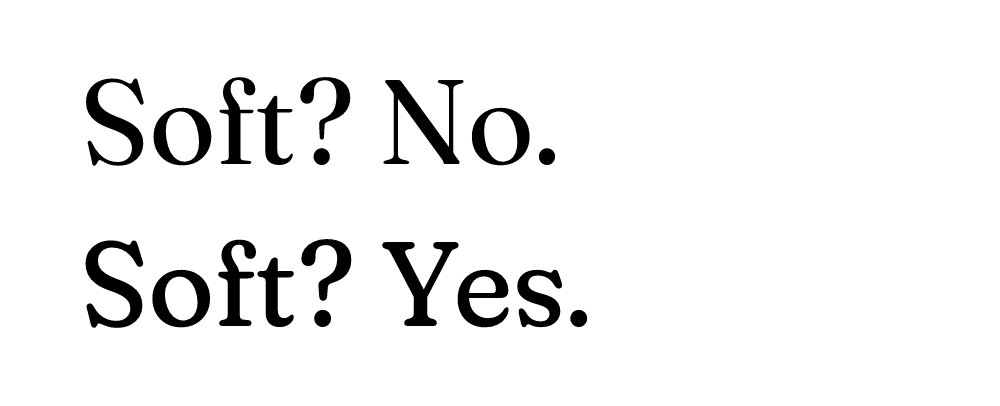
View example: Setting values for custom axes
#set text(font: "Fraunces", size: 60pt)
#text(variations: (SOFT: 0))[Soft? No.] \
#text(variations: (SOFT: 100))[Soft? Yes.]
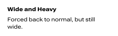
View example: Overriding automatically set values
#set text(
font: "Roboto Flex",
weight: 900,
stretch: 150%,
)
Wide and Heavy
#text(variations: (wght: 400))[
Forced back to normal,
but still wide.
]
bodyDefault: []
Content in which all text is styled according to the other arguments.
text
The text.