gridElement
Arranges content in a grid.
The grid element allows you to arrange content in a grid. You can define the number of rows and columns, as well as the size of the gutters between them. There are multiple sizing modes for columns and rows that can be used to create complex layouts.
While the grid and table elements work very similarly, they are intended for different use cases and carry different semantics. The grid element is intended for presentational and layout purposes, while the table element is intended for, in broad terms, presenting multiple related data points. Set and show rules on one of these elements do not affect the other. Refer to the Accessibility Section to learn how grids and tables are presented to users of Assistive Technology (AT) like screen readers.
Sizing the tracks
A grid’s sizing is determined by the track sizes specified in the arguments. There are multiple sizing parameters: columns, rows and gutter. Because each of the sizing parameters accepts the same values, we will explain them just once, here. Each sizing argument accepts an array of individual track sizes. A track size is either:
auto: The track will be sized to fit its contents. It will be at most as large as the remaining space. If there is more than oneautotrack width, and together they claim more than the available space, theautotracks will fairly distribute the available space among themselves.A fixed or relative length (e.g.
10ptor20% - 1cm): The track will be exactly of this size.A fractional length (e.g.
1fr): Once all other tracks have been sized, the remaining space will be divided among the fractional tracks according to their fractions. For example, if there are two fractional tracks, each with a fraction of1fr, they will each take up half of the remaining space.
To specify a single track, the array can be omitted in favor of a single value. To specify multiple auto tracks, enter the number of tracks instead of an array. For example, columns: 3 is equivalent to columns: (auto, auto, auto).
Examples
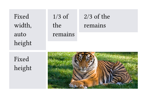
The example below demonstrates the different track sizing options. It also shows how you can use grid.cell to make an individual cell span two grid tracks.
// We use `rect` to emphasize the
// area of cells.
#set rect(
inset: 8pt,
fill: rgb("e4e5ea"),
width: 100%,
)
#grid(
columns: (60pt, 1fr, 2fr),
rows: (auto, 60pt),
gutter: 3pt,
rect[Fixed width, auto height],
rect[1/3 of the remains],
rect[2/3 of the remains],
rect(height: 100%)[Fixed height],
grid.cell(
colspan: 2,
image("tiger.jpg", width: 100%),
),
)
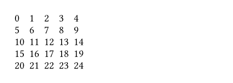
You can also spread an array of strings or content into a grid to populate its cells.
#grid(
columns: 5,
gutter: 5pt,
..range(25).map(str)
)
Styling the grid
The grid and table elements work similarly. For a hands-on explanation, refer to the Table Guide; for a quick overview, continue reading.
The grid’s appearance can be customized through different parameters. These are the most important ones:
alignto change how cells are alignedinsetto optionally add internal padding to cellsfillto give cells a backgroundstroketo optionally enable grid lines with a certain stroke
To meet different needs, there are various ways to set them.
If you need to override the above options for individual cells, you can use the grid.cell element. Likewise, you can override individual grid lines with the grid.hline and grid.vline elements.
To configure an overall style for a grid, you may instead specify the option in any of the following fashions:
- As a single value that applies to all cells.
- As an array of values corresponding to each column. The array will be cycled if there are more columns than the array has items.
- As a function in the form of
(x, y) => value. It receives the cell’s column and row indices (both starting from zero) and should return the value to apply to that cell.
#grid(
columns: 5,
// By a single value
align: center,
// By a single but more complicated value
inset: (x: 2pt, y: 3pt),
// By an array of values (cycling)
fill: (rgb("#239dad50"), none),
// By a function that returns a value
stroke: (x, y) => if calc.rem(x + y, 3) == 0 { 0.5pt },
..range(5 * 3).map(n => numbering("A", n + 1))
)
On top of that, you may apply styling rules to grid and grid.cell. Especially, the x and y fields of grid.cell can be used in a where selector, making it possible to style cells at specific columns or rows, or individual positions.
Stroke styling precedence
As explained above, there are three ways to set the stroke of a grid cell: through grid.cell’s stroke field, by using grid.hline and grid.vline, or by setting the grid’s stroke field. When multiple of these settings are present and conflict, the hline and vline settings take the highest precedence, followed by the cell settings, and finally the grid settings.
Furthermore, strokes of a repeated grid header or footer will take precedence over regular cell strokes.
Accessibility
Grids do not carry any special semantics. Assistive Technology (AT) does not offer the ability to navigate two-dimensionally by cell in grids. If you want to present tabular data, use the table element instead.
AT will read the grid cells in their semantic order. Usually, this is the order in which you passed them to the grid. However, if you manually positioned them using grid.cell’s x and y arguments, cells will be read row by row, from left to right (in left-to-right documents). A cell will be read when its position is first reached.
Parameters
columnsDefault: ()
The column sizes.
Either specify a track size array or provide an integer to create a grid with that many auto-sized columns. Note that opposed to rows and gutters, providing a single track size will only ever create a single column.
See the track size section above for more details.
rowsDefault: ()
The row sizes.
If there are more cells than fit the defined rows, the last row is repeated until there are no more cells.
See the track size section above for more details.
gutterDefault: ()
The gaps between rows and columns. This is a shorthand to set column-gutter and row-gutter to the same value.
If there are more gutters than defined sizes, the last gutter is repeated.
See the track size section above for more details.
column-gutterDefault: ()
The gaps between columns.
row-gutterDefault: ()
The gaps between rows.
insetDefault: (:)
How much to pad the cells’ content.
To specify a uniform inset for all cells, you can use a single length for all sides, or a dictionary of lengths for individual sides. See the box’s documentation for more details.
To specify varying inset for different cells, you can:
- use a single inset for all cells
- use an array of insets corresponding to each column
- use a function that maps a cell’s position to its inset
See the styling section above for more details.
In addition, you can find an example at the table.inset parameter.
alignDefault: auto
How to align the cells’ content.
If set to auto, the outer alignment is used.
You can specify the alignment in any of the following fashions:
- use a single alignment for all cells
- use an array of alignments corresponding to each column
- use a function that maps a cell’s position to its alignment
See the styling section above for details.
In addition, you can find an example at the table.align parameter.
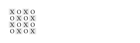
fillDefault: none
How to fill the cells.
This can be:
- a single color for all cells
- an array of colors corresponding to each column
- a function that maps a cell’s position to its color
Most notably, arrays and functions are useful for creating striped grids. See the styling section above for more details.
 View example
#grid(
fill: (x, y) =>
if calc.even(x + y) { luma(230) }
else { white },
align: center + horizon,
columns: 4,
inset: 2pt,
[X], [O], [X], [O],
[O], [X], [O], [X],
[X], [O], [X], [O],
[O], [X], [O], [X],
)
strokeDefault: (:)
How to stroke the cells.
Grids have no strokes by default, which can be changed by setting this option to the desired stroke.
If it is necessary to place lines which can cross spacing between cells produced by the gutter option, or to override the stroke between multiple specific cells, consider specifying one or more of grid.hline and grid.vline alongside your grid cells.
To specify the same stroke for all cells, you can use a single stroke for all sides, or a dictionary of strokes for individual sides. See the rectangle’s documentation for more details.
To specify varying strokes for different cells, you can:
- use a single stroke for all cells
- use an array of strokes corresponding to each column
- use a function that maps a cell’s position to its stroke
See the styling section above for more details.
View example: Passing a function to set a stroke based on position
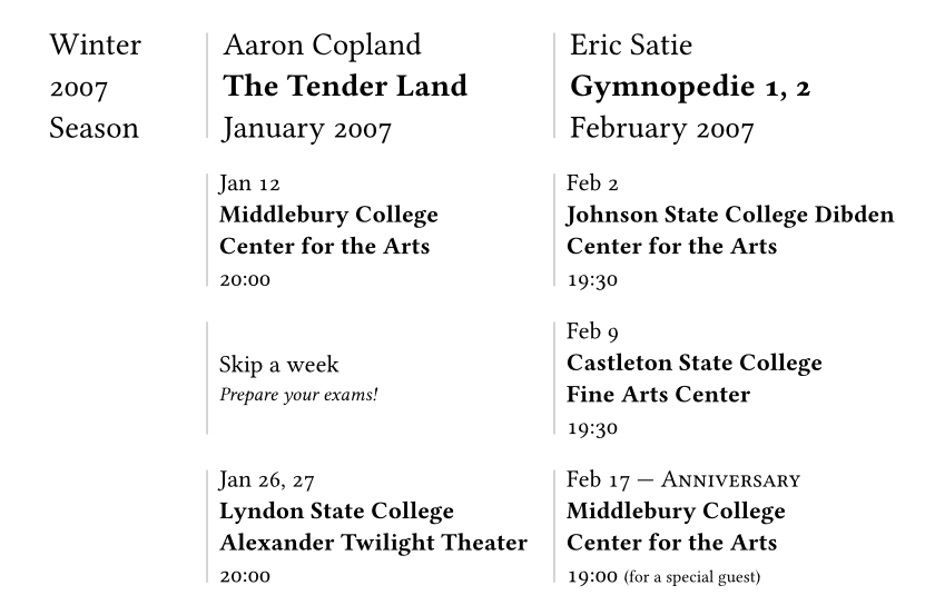
#set page(width: 420pt)
#set text(number-type: "old-style")
#show grid.cell.where(y: 0): set text(size: 1.3em)
#grid(
columns: (1fr, 2fr, 2fr),
row-gutter: 1.5em,
inset: (left: 0.5em),
stroke: (x, y) => if x > 0 { (left: 0.5pt + gray) },
align: horizon,
[Winter \ 2007 \ Season],
[Aaron Copland \ *The Tender Land* \ January 2007],
[Eric Satie \ *Gymnopedie 1, 2* \ February 2007],
[],
[Jan 12 \ *Middlebury College \ Center for the Arts* \ 20:00],
[Feb 2 \ *Johnson State College Dibden Center for the Arts* \ 19:30],
[],
[Skip a week \ #text(0.8em)[_Prepare your exams!_]],
[Feb 9 \ *Castleton State College \ Fine Arts Center* \ 19:30],
[],
[Jan 26, 27 \ *Lyndon State College Alexander Twilight Theater* \ 20:00],
[
Feb 17 --- #smallcaps[Anniversary] \
*Middlebury College \ Center for the Arts* \
19:00 #text(0.7em)[(for a special guest)]
],
)
View example: Folding the stroke dictionary
#set page(height: 13em, width: 26em)
#let cv(..jobs) = grid(
columns: 2,
inset: 5pt,
stroke: (x, y) => if x == 0 and y > 0 {
(right: (
paint: luma(180),
thickness: 1.5pt,
dash: "dotted",
))
},
grid.header(grid.cell(colspan: 2)[
*Professional Experience*
#box(width: 1fr, line(length: 100%, stroke: luma(180)))
]),
..{
let last = none
for job in jobs.pos() {
(
if job.year != last [*#job.year*],
[
*#job.company* - #job.role _(#job.timeframe)_ \
#job.details
]
)
last = job.year
}
}
)
#cv(
(
year: 2012,
company: [Pear Seed & Co.],
role: [Lead Engineer],
timeframe: [Jul - Dec],
details: [
- Raised engineers from 3x to 10x
- Did a great job
],
),
(
year: 2012,
company: [Mega Corp.],
role: [VP of Sales],
timeframe: [Mar - Jun],
details: [- Closed tons of customers],
),
(
year: 2013,
company: [Tiny Co.],
role: [CEO],
timeframe: [Jan - Dec],
details: [- Delivered 4x more shareholder value],
),
(
year: 2014,
company: [Glorbocorp Ltd],
role: [CTO],
timeframe: [Jan - Mar],
details: [- Drove containerization forward],
),
)


children
The contents of the grid cells, plus any extra grid lines specified with the grid.hline and grid.vline elements.
The cells are populated in row-major order.
Definitions
cellElement
A cell in the grid. You can use this function in the argument list of a grid to override grid style properties for an individual cell or manually positioning it within the grid. You can also use this function in show rules to apply certain styles to multiple cells at once.
For example, you can override the position and stroke for a single cell:
View example
#set text(15pt, font: "Noto Sans Symbols 2")
#show regex("[♚-♟︎]"): set text(fill: rgb("21212A"))
#show regex("[♔-♙]"): set text(fill: rgb("111015"))
#grid(
fill: (x, y) => rgb(
if calc.odd(x + y) { "7F8396" }
else { "EFF0F3" }
),
columns: (1em,) * 8,
rows: 1em,
align: center + horizon,
[♖], [♘], [♗], [♕], [♔], [♗], [♘], [♖],
[♙], [♙], [♙], [♙], [], [♙], [♙], [♙],
grid.cell(
x: 4, y: 3,
stroke: blue.transparentize(60%)
)[♙],
..(grid.cell(y: 6)[♟],) * 8,
..([♜], [♞], [♝], [♛], [♚], [♝], [♞], [♜])
.map(grid.cell.with(y: 7)),
)
You may also apply a show rule on grid.cell to style all cells at once, which allows you, for example, to apply styles based on a cell’s position. Refer to the examples of the table.cell element to learn more about this.
body
The cell’s body.
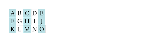
xDefault: auto
The cell’s column (zero-indexed). This field may be used in show rules to style a cell depending on its column.
You may override this field to pick in which column the cell must be placed. If no row (y) is chosen, the cell will be placed in the first row (starting at row 0) with that column available (or a new row if none). If both x and y are chosen, however, the cell will be placed in that exact position. An error is raised if that position is not available (thus, it is usually wise to specify cells with a custom position before cells with automatic positions).
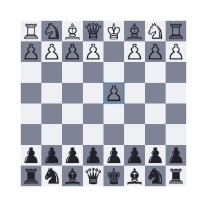
View example
#let circ(c) = circle(
fill: c,
width: 5mm,
)
#grid(
columns: 4,
rows: 7mm,
stroke: .5pt + blue,
align: center + horizon,
inset: 1mm,
grid.cell(x: 2, y: 2, circ(aqua)),
circ(yellow),
grid.cell(x: 3, circ(green)),
circ(black),
)
yDefault: auto
The cell’s row (zero-indexed). This field may be used in show rules to style a cell depending on its row.
You may override this field to pick in which row the cell must be placed. If no column (x) is chosen, the cell will be placed in the first column (starting at column 0) available in the chosen row. If all columns in the chosen row are already occupied, an error is raised.
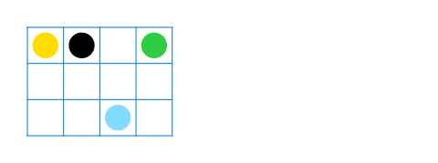
View example
#let tri(c) = polygon.regular(
fill: c,
size: 5mm,
vertices: 3,
)
#grid(
columns: 2,
stroke: blue,
inset: 1mm,
tri(black),
grid.cell(y: 1, tri(teal)),
grid.cell(y: 1, tri(red)),
grid.cell(y: 2, tri(orange))
)
colspanDefault: 1
The amount of columns spanned by this cell.
rowspanDefault: 1
The amount of rows spanned by this cell.
insetDefault: auto
The cell’s inset override.
alignDefault: auto
The cell’s alignment override.
fillDefault: auto
The cell’s fill override.
strokeDefault: (:)
The cell’s stroke override.
breakableDefault: auto
Whether rows spanned by this cell can be placed in different pages. When equal to auto, a cell spanning only fixed-size rows is unbreakable, while a cell spanning at least one auto-sized row is breakable.
hlineElement
A horizontal line in the grid.
Overrides any per-cell stroke, including stroke specified through the grid’s stroke field. Can cross spacing between cells created through the grid’s column-gutter option.
An example for this function can be found at the table.hline element.
yDefault: auto
The row above which the horizontal line is placed (zero-indexed). If the position field is set to bottom, the line is placed below the row with the given index instead (see grid.hline.position for details).
Specifying auto causes the line to be placed at the row below the last automatically positioned cell (that is, cell without coordinate overrides) before the line among the grid’s children. If there is no such cell before the line, it is placed at the top of the grid (row 0). Note that specifying for this option exactly the total amount of rows in the grid causes this horizontal line to override the bottom border of the grid, while a value of 0 overrides the top border.
startDefault: 0
The column at which the horizontal line starts (zero-indexed, inclusive).
endDefault: none
The column before which the horizontal line ends (zero-indexed, exclusive). Therefore, the horizontal line will be drawn up to and across column end - 1.
A value equal to none or to the amount of columns causes it to extend all the way towards the end of the grid.
strokeDefault: 1pt + black
The line’s stroke.
Specifying none removes any lines previously placed across this line’s range, including hlines or per-cell stroke below it.
positionDefault: top
The position at which the line is placed, given its row (y) - either top to draw above it or bottom to draw below it.
This setting is only relevant when row gutter is enabled (and shouldn’t be used otherwise - prefer just increasing the y field by one instead), since then the position below a row becomes different from the position above the next row due to the spacing between both.
vlineElement
A vertical line in the grid.
Overrides any per-cell stroke, including stroke specified through the grid’s stroke field. Can cross spacing between cells created through the grid’s row-gutter option.
xDefault: auto
The column before which the vertical line is placed (zero-indexed). If the position field is set to end, the line is placed after the column with the given index instead (see grid.vline.position for details).
Specifying auto causes the line to be placed at the column after the last automatically positioned cell (that is, cell without coordinate overrides) before the line among the grid’s children. If there is no such cell before the line, it is placed before the grid’s first column (column 0). Note that specifying for this option exactly the total amount of columns in the grid causes this vertical line to override the end border of the grid (right in LTR, left in RTL), while a value of 0 overrides the start border (left in LTR, right in RTL).
startDefault: 0
The row at which the vertical line starts (zero-indexed, inclusive).
endDefault: none
The row on top of which the vertical line ends (zero-indexed, exclusive). Therefore, the vertical line will be drawn up to and across row end - 1.
A value equal to none or to the amount of rows causes it to extend all the way towards the bottom of the grid.
strokeDefault: 1pt + black
The line’s stroke.
Specifying none removes any lines previously placed across this line’s range, including vlines or per-cell stroke below it.
positionDefault: start
The position at which the line is placed, given its column (x) – either start to draw before it or end to draw after it.
The values left and right are also accepted, but discouraged as they cause your grid to be inconsistent between left-to-right and right-to-left documents.
This setting is only relevant when column gutter is enabled (and shouldn’t be used otherwise – prefer just increasing the x field by one instead), since then the position after a column becomes different from the position before the next column due to the spacing between both.
headerElement
A repeatable grid header.
If repeat is set to true, the header will be repeated across pages. For an example, refer to the table.header element and the grid.stroke parameter.
repeatDefault: true
Whether this header should be repeated across pages.
levelDefault: 1
The level of the header. Must not be zero.
This allows repeating multiple headers at once. Headers with different levels can repeat together, as long as they have ascending levels.
Notably, when a header with a lower level starts repeating, all higher or equal level headers stop repeating (they are “replaced” by the new header).
children
The cells and lines within the header.
footerElement
A repeatable grid footer.
Just like the grid.header element, the footer can repeat itself on every page of the grid.
No other grid cells may be placed after the footer.
repeatDefault: true
Whether this footer should be repeated across pages.
children
The cells and lines within the footer.