Accessibility does not need to be hard. Learn how to create accessible PDFs with Typst without any additional software while reaching new audiences and meeting compliance requirements.
 by Martin Haug
If you search online for "how to create accessible PDF", you will come up with no shortage of posts explaining how to make a PDF accessible once it has been created. Browsing the results, you will learn that even when exporting with the right settings from apps like Microsoft Word, you will end up with a file that needs more manual modifications to be truly accessible. You will see a plethora of checklists that you will need to complete manually and you will need to learn about PDF Tags. You might even need to buy an Adobe Acrobat subscription, just to fix up your files. Like this, accessibility can turn from a basic requirement into an expensive, time-consuming chore.
The chasm between accessibility and reality
It's true that accessibility is an important quality of every document: Without it, you are excluding a lot of people from your document, losing you exposure and creating friction. Depending on your organization's and country's policies, accessibility might even be required. Yet, with most software, accessibility remains an afterthought – a checklist to complete manually after the document is otherwise finished.
Instead, what if accessibility was taken care of by the time you are done with your project? If you did not need to manually follow a checklist, but had accessibility issues raised to you throughout the writing process? What if you could be certain that the resulting file will offer screen reader users a good experience and matches international accessibility standards?
Fortunately, that's exactly what we have built with Typst. Typst is a markup-based professional writing platform. When using Typst, you write your content and add structure with markup. Typst will use this markup to format your document with a template and publisher-grade typesetting, and crucially, it also uses the same information to create an accessible file. This means that if you follow just a few best practices, your file will be accessible when it looks right.
Basics: What makes a PDF accessible?
But let's take a step back: What does it mean for a PDF to be accessible? To the layperson, there are a few visual and a lot of hidden distinctions. First, an accessible PDF is designed to accommodate readers who have difficulty distinguishing colors or reading low-contrast text. You can achieve this by choosing high-contrast foregrounds and backgrounds and ensuring no information is conveyed solely through the use of color.
But the normally invisible features are what sets a high-quality PDF apart: At a technical level, it contains semantic data screen readers use to read the file correctly to users with low or no vision. Without this data, your file may have any or all of the following problems when read by a screen reader:
- It will be read in the wrong order
- The contents of images and graphics will not be announced
- The screen reader may fail to use your document's language to determine the right pronunciation,
- The text within your document might not be read accurately
Additionally, an accessible file allows screen reader users to navigate between sections and understand when content is emphasized. The data that prevents these issues and enables seamless navigatation of your file is called tags.
How to get a tagged PDF
Tagging PDFs is where you run into problems with most software. When manual formatting is encouraged over an automatic template, software simply cannot write the right tags. Is your bold text with larger font size a heading? A pull quote? Or just strong emphasis? Tags make this distinction explicit by telling the screen reader what each part of the document means on a semantic level. However, even when using tools like Word’s built-in formatting presets for headings etc., not all content that should receive dedicated tags actually gets them, creating the need to manually post-process the file in Acrobat. The boldface button's decade-long allure to Word users is unbroken – and it's standing between authors and accessible documents. Finally, many tools require special settings to produce a Tagged PDF. For example, printing to PDF will result in an untagged file. Even in LaTeX, the user must use the relatively new and little-known macro \DocumentMetadata to receive a tagged file.
Typst takes a different approach. We structured Typst around elements, building blocks that carry meaning, not just appearance. If you have already used Typst, you have interacted with them, even if you did not realize it. For example, every character in your document is part of a text element. Likewise, every time you used asterisks for boldface, you create a strong emphasis element. This extends to tables, bibliographies, and more.
Many of Typst's elements have strong semantic meaning vital to screen reader users. We mentioned headings above. The figure and the table elements are equally important: Screen readers can only help users understand complex content like tables and images if they are properly tagged. Typst uses the rich semantic information it already has about these elements to automatically write tags in the final PDF.
Accessibility out of the box with Typst
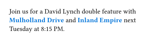
In this section, we will take a closer look at Typst's design makes it easy to create accessible files. As mentioned above, elements are central to Typst and pervasive across all documents. Therefore, the easiest way to create your document is also the most accessible. Consider the following example, for a brochure where emphasis is rendered in blue. First, let's look at an example that uses the strong emphasis element with markup and a show set rule:
#show strong: set text(fill: blue)

Join us for a David Lynch double
feature with *Mulholland Drive* and
*Inland Empire* next Tuesday
at 8:15 PM.
Next, let's look at what happens when we manually apply the formatting with the text function instead of using semantic markup:
Join us for a David Lynch double
feature with
#text(fill: blue, weight: "bold")[
  Mulholland Drive
]
and
#text(fill: blue, weight: "bold")[
  Inland Empire
] next Tuesday at 8:15 PM.

This example looks identical to the first one, but it has fatal flaws. First, we need to repeat the formatting parameters each time, making changes tedious and error-prone. More importantly, the emphasis has become invisible to screen readers. The formatting instructions had no effect on the semantic information exposed to assistive technologies. Typst's design actively encourages use of its built-in elements: Set and show rules only work with elements. They are exposed with convenient markup and enable you to use the powerful templates on Typst Universe. By following our best practices, accessibility comes automatically.
There are some elements that play an outsized role in accessibility. When editing your document, always remember to use these elements when applicable:
-
Use
table.headerandtable.footerfor header and footer rows instead of normal cells. -
Use
tableif tabular layout conveys data, andgridwhen used exclusively for design purposes. -
Use the
figureelement to enclose and describe graphics.
For some elements, Typst needs more information than it can infer from markup alone. Instead, your input is needed. The most prominent example for this are images and graphics. Since screen reader users cannot see them, you need to provide an alternative description that the screen reader can announce instead. Use the alt parameter of the image function:
#image(
  "heron.jpg",
  // The verbosity required for the
  // alternative description depends
  // on the context of the image.
  alt: "Heron in flight with feet and wings spread",
)

Typst also allows you to draw figures, either with the built in shapes and paths or with packages like CeTZ. To provide alternative descriptions for these, use the figure element's alt parameter. We have compiled guidance on how to write good alternative descriptions in our Accessibility Guide.
More checks for maximum accessibility & compliance
Because it's easy to forget alternative descriptions, Typst can surface errors when they're missing. When you opt into PDF/UA-1 export, Typst will check for accessibility issues during export. If it finds critical issues like missing alternative descriptions, it will not create a PDF and instead show you what to change. PDF/UA-1 is an international standard for universally accessible files that provide the best possible experience for screen reader users. You can enable PDF/UA-1 in the PDF export dialog in the web app or with the --pdf-standard flag on the CLI.
No matter whether you choose to enable PDF/UA-1 or not, Typst writes Tagged PDF files by default, providing a baseline for accessibility. For other topics around accessible files, like use of color, natural language specification, and more, be sure to check out our Accessibility Guide.
Conclusion
Throughout this blog post, we have seen what creating accessible PDFs has meant so far and how it can look with Typst: Instead of following checklists, running external validators, and manually fixing tags in Acrobat, Typst leverages semantic elements and built-in validation to create PDFs that are accessible from the moment they compile. With this approach, accessibility is no longer a compliance chore imposed by the EAA, ADA, Section 508, or other regulations. Instead, it becomes an asset: well-structured, maintainable documents with scalable templates that reach your audience, regardless of how they access your content.
Try Typst in our web app or with the open-source compiler and benefit from accessibility by default. And to make even more informed choices, learn about the best practices about universally accessible documents in our documentation.