
A Monash-inspired slide theme for Typst, built on Touying. It is meant for research talks, lectures, and short presentations, and works with one import.
This is an unofficial community package. It is not affiliated with or endorsed by Monash University.
| Title slide | Content slide | Environments |
|---|---|---|
 |
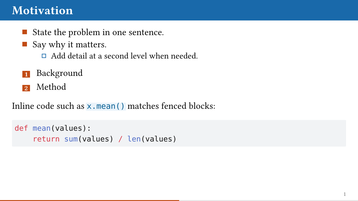 |
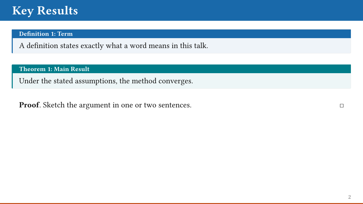 |
Quick start
Create a deck from the template:
typst init @preview/unofficial-monash-touying:1.0.0 my-talk
Or start from scratch:
#import "@preview/unofficial-monash-touying:1.0.0": *

#show: monash-theme.with(
  config-info(
    title: [Presentation Title],
    subtitle: [Subtitle],
    author: [Your Name],
    institution: [Monash University],
    date: datetime.today(),
  ),
)
#show: show-monash-frames

#title-slide()

= Section

== Slide title

- A level-one heading starts a section; a level-two heading starts a slide.
- `#pause` reveals the rest of a slide on the next click.
The examples/ folder has four complete decks:
showcase (a tour of every feature),
research-talk,
lecture, and
short-talk.
Options
All options are named arguments of monash-theme. Touying settings are
passed as positional config-*(..) arguments, as in the quick start.
| Option | Default | Values | Effect |
|---|---|---|---|
aspect-ratio |
"16-9" |
"16-9", "4-3" |
Slide format. |
font |
auto |
auto, a family name, or an array of names |
Text font. auto keeps Typst’s default font. See Fonts. |
code-font |
"DejaVu Sans Mono" |
a family name or an array of names | Font of code. |
font-size |
22pt |
length | Body text size. |
title-font-size |
36pt |
length | Title size on the title slide. |
title-color |
black |
color | Colour of the title-slide text. |
title-graphic |
auto |
auto, none, or content |
auto: the bundled background. none: a plain cover drawn with shapes. Content: your own, e.g. image("bg.png", width: 100%, height: 100%, fit: "cover"). |
accent-color |
monash-orange |
color | List markers, strong text, progress bar, outline and section numbers. |
logo |
none |
none, content, or (cover: .., bar: .., bar-fill: ..) |
Your logo: top-left on the title and ending slides, and on a white panel at the right of the title bar. See Logos. |
outline |
true |
bool | Whether #title-slide() is followed by an outline slide. |
section-slides |
true |
bool | Whether each level-one heading creates a divider slide. Sections still appear in the outline and PDF bookmarks. |
progress-bar |
true |
bool | The progress bar along the bottom edge. |
slide-numbering |
"1" |
none or a numbering pattern |
"1" shows the slide number; a pattern with two counting symbols such as "1 / 1" adds the total; none hides it. |
footer |
none |
none, auto, or content |
Text at the left of the footer. auto shows the short title (or the title) and the author. |
Title, author, and so on are set with Touying’s
config-info(title:, short-title:, subtitle:, author:, institution:, date:).
Slide kinds
| Function | Purpose |
|---|---|
title-slide(extra: none) |
Cover with the config-info metadata. Followed by an outline slide unless outline: false. |
outline-slide(title: auto, depth: 1) |
An outline of the main sections, anywhere in the deck. |
slide(..) |
A content slide. == Heading creates one; call it directly for layouts such as #slide(composer: (1fr, 1fr))[Left][Right]. |
new-section-slide |
The divider slide made for each = Section. Turn these off with section-slides: false. |
focus-slide[..] |
One statement, large and white on a full Monash blue slide. |
ending-slide(title: [Thank you])[..] |
A closing slide with free content such as contact details. |
Title, outline, section, focus, and ending slides do not advance the slide number.
Long headings. A slide heading that does not fit on one line first shrinks (to at most 75%) and then wraps; the title bar grows to fit. If a slide has more content than fits, it continues on a further page with the same title bar.
Many sections. The outline slide lists up to 6 sections in one column and more in two. Section dividers show at most 5 neighbouring sections, with dots for the rest. Up to 12 sections, each of these fits on one slide. With more sections, or very long section titles, the outline first shrinks to about half size and then continues on a second page.
Backup slides. After #show: appendix, sections are lettered (A, B, …),
left out of every outline, and not counted in the slide total, and the
progress bar is full on the last main slide.
Environments
Activate the environments with #show: show-monash-frames after the theme.
| Numbered | Unnumbered |
|---|---|
definition, theorem, lemma, corollary, proposition, assumption, example, exercise |
remark, note, warning |
Every environment takes a body, and optionally a title before it:
#theorem[Every contraction has a unique fixed point.]
#theorem[Banach][Every contraction has a unique fixed point.] <banach>

By @banach, the iteration converges.   // "By Theorem 2, ..."

#proof[Apply the contraction twice.]
#proof[Sketch][Apply the contraction twice.]
A label after an environment makes it referable with @label. proof ends
with a square at the right of its last line.
Numbering options:
#show: show-monash-frames                               // Theorem 1, Lemma 1
#show: show-monash-frames.with(shared-counter: true)    // Theorem 1, Lemma 2
#show: show-monash-frames.with(numbering: false)        // no numbers
With shared-counter: true, definitions, theorems, lemmas, corollaries,
propositions, and assumptions share one counter; examples and exercises keep
their own.
Fonts
By default (font: auto) the theme does not choose a font: slides use Typst’s
built-in default font, which is embedded in the compiler, so a deck compiles
the same way on every computer and on typst.app. A font you set with
#set text(font: ..) before the theme is kept.
For the Monash look, use Arial:
#show: monash-theme.with(font: "Arial")
Typst warns unknown font family when a named font is not installed, and
falls back to its default font. If Arial is not available, Noto Sans is a
freely available sans-serif alternative (from Google Fonts).
For Chinese, Japanese, or Korean text, append a CJK font. Latin text keeps the first font; only the characters it lacks use the CJK font:
#show: monash-theme.with(font: ("Arial", "Noto Sans CJK SC"))
Math uses Typst’s math font. To change it, add a show rule after the theme,
for example #show math.equation: set text(font: "New Computer Modern Math").
Logos
The package bundles no Monash logos, crests, or wordmarks: they are trademarks, and the right to use them depends on who you are and what the slides are for. Get your institution’s logo from its official brand resources (for Monash, the university’s brand guidelines and logo files for staff and students) and follow the usage rules that come with it.
Put the file in your project, for example in the assets/ folder that
typst init creates, and pass it with one line. SVG and PNG both work:
#show: monash-theme.with(logo: image("assets/logo.svg"))
The logo then appears in two places:
- in the top-left corner of the title slide and the ending slide, large, with the title below it;
- at the right end of the blue title bar on content slides, on a small white panel, so the ordinary dark or coloured version of the logo stays readable.
Each logo is scaled to fit its place, so the image’s own size does not matter: a wide logo is limited by width and a square or stacked one by height. Crop any empty margin out of your logo file first; whitespace inside the image counts as part of the logo and makes it look small.
If you have more than one version of the logo, choose one per place:
#show: monash-theme.with(
  logo: (
    cover: image("assets/logo.svg"),
    bar: image("assets/logo-white.svg"),
    bar-fill: none,
  ),
)
cover and bar are each optional; leave one out to show nothing there.
bar-fill is the panel behind the bar logo: white by default, another
colour, or none to draw the logo straight onto the blue bar. Use none
only with a white or reversed logo, because the bar is Monash blue.
The bundled title background is a logo-free graphic derived from the CC0 Quarto Monash presentation template.
Tables
The first row of every table is styled as a header (tinted and bold),
whether or not it is a table.header. To opt out for a table, give it its
own fill: and stroke: and add
#show table.cell.where(y: 0): set text(weight: "regular", fill: black) in
the same scope.
Citations
Cite with @key as usual. A bibliography on its own slide is set compactly,
without a second heading, and continues onto further slides when long:
== References
#bibliography("refs.bib")
To show each citation as a footnote on the slide where it is made, turn on
Touying’s built-in option and keep the #bibliography(..) call:
#show: monash-theme.with(config-common(show-bibliography-as-footnote: true))
See examples/research-talk.typ. Touying’s
FAQ covers the details.
Handouts
config-common(handout: true) collapses every animated slide to its final
state, one page per slide, for printed notes. See Touying’s
handout guide;
#handout-only[..] adds content to the handout only.
Speaker notes
Write notes with #speaker-note[..] after a slide’s content. To see them,
use a presenter tool with Touying’s .pdfpc export, or
config-common(show-notes-on-second-screen: right), which draws a notes
panel in the theme’s colours next to each slide. See Touying’s
speaker notes guide.
Exported names
The package exports exactly these names (checked by tests/api.typ):
- Theme and slides:
monash-theme,title-slide,outline-slide,slide,new-section-slide,focus-slide,ending-slide. - Environments:
show-monash-frames,monash-frame-style,definition,theorem,lemma,corollary,proposition,assumption,example,exercise,remark,note,warning,proof. - Design:
monash-accent-ruleand the coloursmonash-blue,monash-blue-dark,monash-blue-grey,monash-blue-wash,monash-charcoal,monash-dark-grey,monash-green,monash-grey,monash-grey-light,monash-grey-soft,monash-muted,monash-orange,monash-orange-soft,monash-paper,monash-slate,monash-teal. - From Touying:
pause,meanwhile,uncover,only,alternatives,item-by-item,effect,jump,waypoint,touying-recall,alert,speaker-note,appendix,handout-only,cols,side-by-side,empty-slide,config-info,config-common,config-page,config-colors,config-methods,config-store,components,utils. See the Touying documentation for these.
For other Touying functions, import Touying alongside this package.
docs/reference.typ compiles to an API reference generated from the doc
comments.
Migrating from 0.1.x
1.0.0 renames options to Typst’s kebab-case style. Old names stop with an error that names the replacement.
| 0.1.x | 1.0.0 |
|---|---|
fontsize |
font-size |
titlefontsize |
title-font-size |
titlecolor |
title-color |
titlegraphic: "path.png" |
title-graphic: image("path.png", width: 100%, height: 100%, fit: "cover") (a path string was resolved inside the package) |
toc |
outline |
toc-args |
removed; set outline: false and call #outline-slide(..) |
brand-motif, motto, progress-position |
removed (they had no effect) |
Other changes to check in an existing deck:
- A single-argument environment call is now the body:
#theorem[X]shows X as the statement with no title, while 0.1.x used X as the title. Use#theorem[Title][Body], or#theorem[Title][]for a title alone;proofworks the same way. - The default font is Typst’s own font, not Arial. Add
font: "Arial"to keep the old look. noteandwarningare no longer numbered.- The package no longer re-exports all of Touying; see Exported names.
progress-bar: falsenow takes effect, andlogo:now shows the logo, on the title and ending slides and on a white panel in the title bar.- Typst 0.15 or newer is required (Touying 0.8.0).
Development
scripts/check.sh                        # compile every deck; fail on any warning
scripts/check.sh --ignore-system-fonts  # as CI does
scripts/check.sh --require-fonts        # fail rather than skip font-dependent decks
scripts/check.sh --thumbnail            # also regenerate the preview images
tests/ holds the stress decks for each requirement; decks that need Arial
or a CJK font run only where that font is installed, and the summary says how
many were skipped. See
CHANGELOG.md for changes between versions.
Credits
The visual direction and the logo-free title background come from the Quarto Monash presentation template, distributed under CC0 1.0. Monash names, logos, crests, and wordmarks remain associated with Monash University and should be used according to its brand guidance. Built on Touying, frame-it, and zebraw.