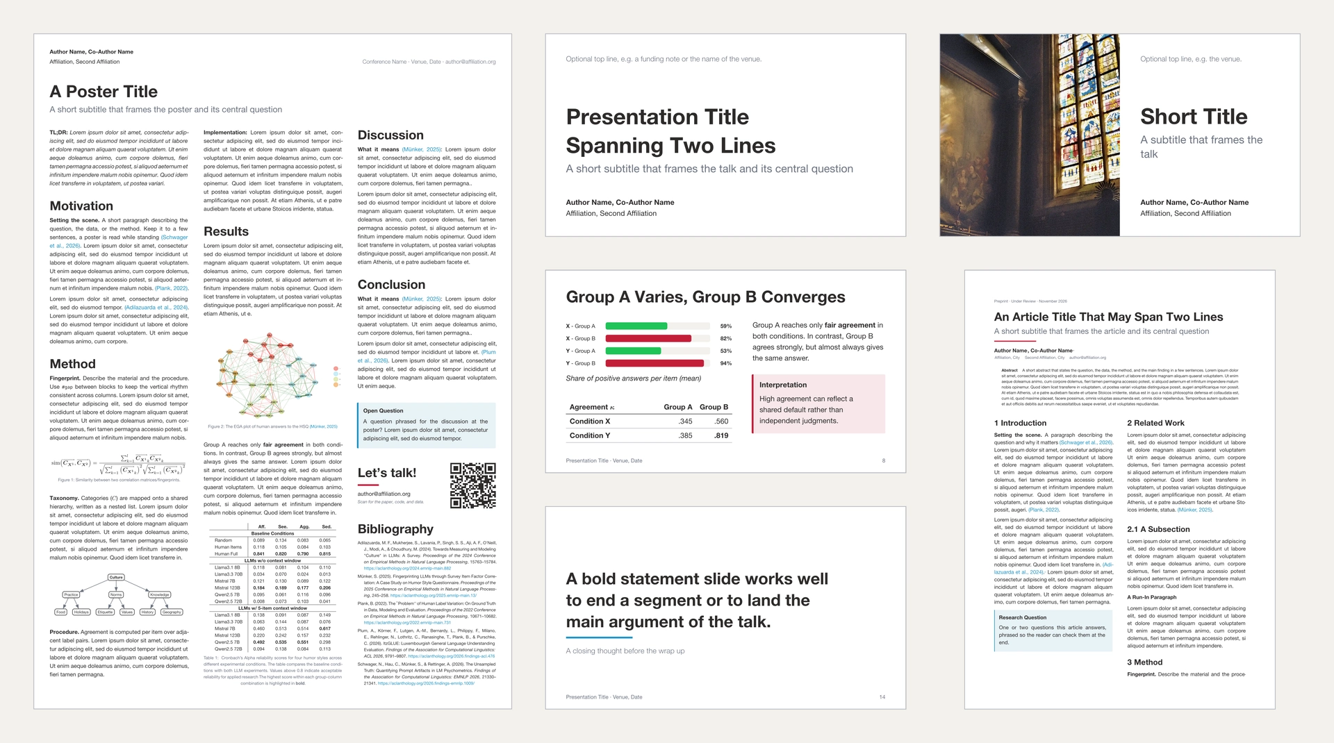
A small design system for academic slides, posters and articles: a shared palette and type scale, a 16:9 slide theme with title, split-title and content layouts, an A0 poster theme with a multi-column layout, an A4 article theme with a title block, abstract and numbered sections, and widgets for cards, key statements and simple bar charts. All themes share the same building blocks, so a deck, a poster and a paper look like they belong together. This repository should be used in academic teaching (including Trier University) as an easy way into Typst: all students can use these as building templates for their slides, poster or paper and fulfill thereby the layout requirements.
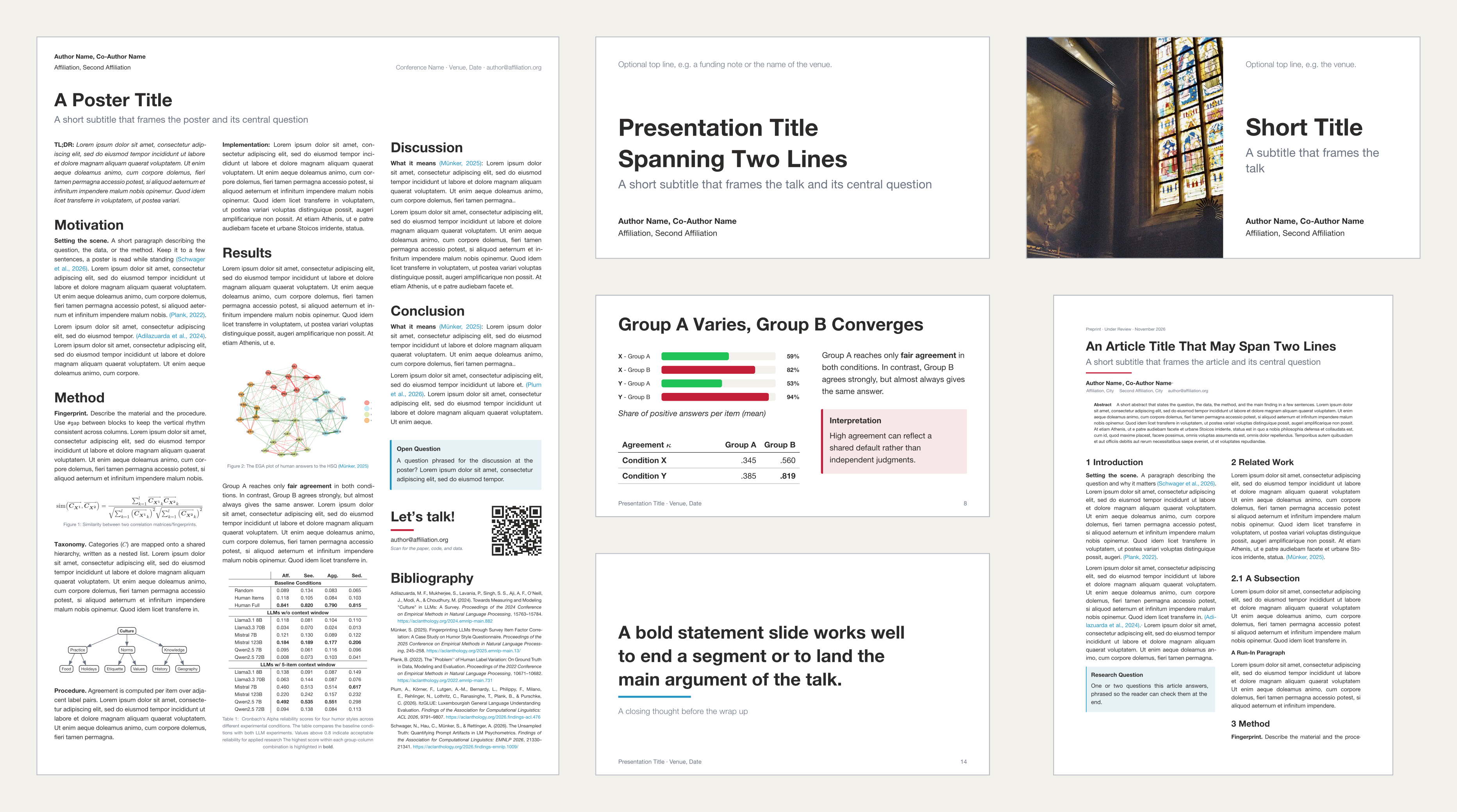
Rendered examples: docs/example_article.pdf · docs/example_poster.pdf · docs/example_slides.pdf
Quick Start
Create a new project from the template (in the Typst web app, choose Start from template and search for aatts):
typst init @preview/aatts:0.1.0 my-project
cd my-project
The project contains one starter file per format. Pick the one you need, edit it, and delete the rest:
| File | Start here for |
|---|---|
slides.typ |
a 16:9 slide deck |
poster.typ |
an A0 poster |
article.typ |
an A4 article |
main.typ |
nothing: it only renders an overview of the examples |
assets/ |
placeholder image, figure, and bibliography |
main.typ is the default compilation target, so compile your chosen file explicitly (in the web app, open your file and click the eye icon next to its name to preview it instead of main.typ):
typst watch slides.typ # or poster.typ, article.typ
To use the design system in an existing project, import the modules directly as below describes.
Design System
constants
| Name | Keys | Values |
|---|---|---|
palette |
red, green, blue, olive, magenta |
Accent colours (red is the default highlight). |
palette.grey |
dark, medium, light |
Text, secondary text, background grey. |
span |
p1 … p12 |
Widths on a 12-column grid; p12 = 100 %. |
font-families |
— | Helvetica Neue, Liberation Sans, Arial. |
units
slides.units, poster.units and article.units hold the size tokens. Each scale is derived from one base value: the poster uses 1.75 × the slide base for type and spacing, and 2 × for stroke weights; the article uses an 11 pt base.
| Name | Keys | slides |
poster |
article |
|---|---|---|---|---|
font (pt) |
xxl, xl, lg, base, sm |
48, 36, 24, 16, 12 |
84, 63, 42, 28, 21 |
30, 24, 16, 10, 8 |
space (cm) |
base, md, sm, xs |
1.6, 0.8, 0.4, 0.2 |
2.8, 1.4, 0.7, 0.35 |
1, 0.5, 0.25, 0.125 |
weight (pt) |
xl, lg, base, sm |
4, 2, 1, 0.5 |
8, 4, 2, 1 |
2, 1, 0.5, 0.25 |
#v(slides.units.space.md)
#text(size: slides.units.font.lg, fill: constants.palette.grey.medium)[Large Muted Text]
Fonts
Fonts are not bundled with the package. The themes try Helvetica Neue, Helvetica, Liberation Sans and Arial in that order; if none is available, Typst falls back to its default font. Pass your own stack to either theme to change it:
#show: slides.theme.style.with(font-families: ("Inter", "Arial"))
slides
#import "@preview/aatts:0.1.0": constants, slides

#show: slides.theme.style.with(footer: [Presentation Title · Venue, Date])
#set document(title: "Presentation Title", author: "Author Name")

#(slides.layouts.title)(
  [Presentation Title],
  subtitle: [A short subtitle that frames the talk],
  meta-bot: [*Author Name* \ Affiliation],
)

#(slides.layouts.base)(title: [Overview])[
  - First point
  - Second point
]
layouts.title
Title slide without footer. meta-top is placed at the top, meta-bot at the bottom.
#slides.layouts.title(
  [Presentation Title],
  subtitle: [Optional subtitle],
  meta-top: [Optional content at the top, e.g. event name],
  meta-bot: [Optional content at the bottom, e.g. author and affiliation],
)
layouts.title-split
Borderless image on the left, title content on the right. columns sets the split (default (1fr, 1fr)).
#slides.layouts.title-split(
  image("cover.jpg"),
  [Presentation Title],
  subtitle: [Optional subtitle],
  meta-top: [Optional content at the top],
  meta-bot: [Optional content at the bottom],
)
layouts.base
Content slide with an optional title and the footer. The body is vertically centred.
#slides.layouts.base(title: [Slide title])[
  Content
]
layouts.empty
Page without margins, header or footer, e.g. for a full-bleed image.
#slides.layouts.empty[
  #image("photo.jpg", width: 100%, height: 100%, fit: "cover")
]
poster
#import "@preview/aatts:0.1.0": constants, poster

#show: poster.theme.style
#set document(title: "Poster Title", author: "Author Name")

#poster.layouts.base(
  title: [Poster Title],
  subtitle: [A short subtitle that frames the poster],
  meta-top: [*Author Name* \ Affiliation #h(1fr) Conference Name · Venue, Date],
)[
  == Motivation

  #poster.widgets.card(title: [Note])[
    Additional context in a highlighted card.
  ]

  #colbreak()

  == Results
]
layouts.base
Stacks meta-top, the title with an optional subtitle, and the body set in columns columns (default 3). Use == Heading for sections and #colbreak() to start the next column.
article
#import "@preview/aatts:0.1.0": constants, article

#show: article.theme.style.with(header: [Short Title · Author Name])
#set document(title: "Article Title", author: "Author Name")

#article.layouts.base(
  title: [Article Title],
  subtitle: [A short subtitle that frames the article],
  authors: [*Author Name* \ Affiliation],
  abstract: [A short abstract.],
)[
  = Introduction

  #lorem(80)

  #bibliography("references.bib", title: [References])
]
The theme sets an A4 page (paper), a running header from the second page on, centred page numbers, justified text, numbered sections (= and ==, === stays unnumbered) and numbered equations.
layouts.base
Stacks the title block (meta-top, title, subtitle, accent line, authors, abstract) and the body. columns: 2 sets the body in two columns below a full-width title block. The title block alone is available as layouts.title-content.
Widgets
The same widgets are available as slides.widgets, poster.widgets and article.widgets.
card
Tinted box with a coloured bar on the left.
#slides.widgets.card(title: [Note], highlight: constants.palette.blue, width: constants.span.p6)[
  Additional context in a highlighted card.
]
statement
Large bold statement with an accent line and an optional byline.
#slides.widgets.statement(byline: [Supporting byline], highlight: constants.palette.red)[
  One sentence the audience should remember.
]
bar-chart
Takes one array per row: label, share between 0 and 1, colour, and the value shown on the right. A single bar is available as bar(share, color).
#slides.widgets.bar-chart(
  ([Group A], 0.72, constants.palette.red, [72 %]),
  ([Group B], 0.45, constants.palette.blue, [45 %]),
  ([Group C], 0.18, constants.palette.green, [18 %]),
)
Development
| Command | Description |
|---|---|
make install_extras |
Install oxipng and typst-package-check. |
make test |
Initialise a project from the template and compile it. |
make check |
Lint the package with typst-package-check. |
make thumbnail |
Render thumbnail.png and docs/preview.png from template/main.typ. |
make examples |
Render docs/example_slides.pdf, docs/example_poster.pdf and docs/example_article.pdf. |
make link |
Link the checkout into the system package folder (for editors). |
make unlink |
Remove that link again. |
make clean |
Remove the build directory. |
The full examples in template also show third-party packages (tdtr, codly, cades).
License
The package (everything outside template/) is licensed under the MIT License. The files in template/ are licensed under MIT-0: you can use, modify, and distribute documents created from the template without attribution. However, the photograph template/assets/image-header_split.webp was taken on film and digitized by the author, Simon Münker, and is released under the same MIT. Please attribute the author when using the picture.