A non-official structured presentation template for Typst, providing three institutional themes: Sorbonne University, IPLESP, and AP-HP. Built on top of the presentate and navigator packages.
Note: The institutional logos in this unofficial version have been replaced by generic placeholders. You can easily replace them with your own assets using the
logoparameters.
Overview
This package offers customizable, academic-ready slide decks with a shared core engine. All three themes benefit from the same powerful features:
- Institutional Identities: Pre-configured colors and logos for Sorbonne University, IPLESP, and AP-HP.
- Dark Mode: Full support for dark-themed slides via the
dark-modeparameter (Sorbonne & IPLESP). - Smart Navigation: Automatic breadcrumbs, transition slides with roadmaps, and flexible hierarchy mapping.
- Dynamic Content: Seamless integration of
pause,uncover, andonlyfor step-by-step reveals.
Sorbonne Theme Presets
Switch between Sorbonne University faculties using the faculty and dark-mode parameters.
| Mode | Univ | Sante | Sciences | Lettres |
|---|---|---|---|---|
| Light |  |
 |
 |
 |
| Dark |  |
 |
 |
 |
univ: Sorbonne Blue (University-wide)sante: Sorbonne Red (Faculty of Health)sciences: Sorbonne Light Blue (Faculty of Science & Engineering)lettres: Sorbonne Yellow/Ocre (Faculty of Humanities)
IPLESP Theme Presets
The IPLESP theme provides multiple color variants via the theme parameter. It features a modern header with a logo bar (Inserm, IPLESP, Sorbonne Health).
| Mode | Blue | Red | Green | Purple |
|---|---|---|---|---|
| Light |  |
 |
 |
 |
| Dark |  |
 |
 |
 |
Other available colors: yellow, teal, orange, slate.
AP-HP Theme
The AP-HP theme (aphp-template) reproduces the official AP-HP institutional PowerPoint layout in Typst.
Two cover styles are available via the cover-style parameter:
| Full (default) | Light |
|---|---|
 |
 |
"full"(default): Large navy panel on the right half of the title slide. The title appears as one or two blue blocks on the white left area."light": White background throughout. An optional classification banner (e.g."Internal") appears at the very top.
Quick Start
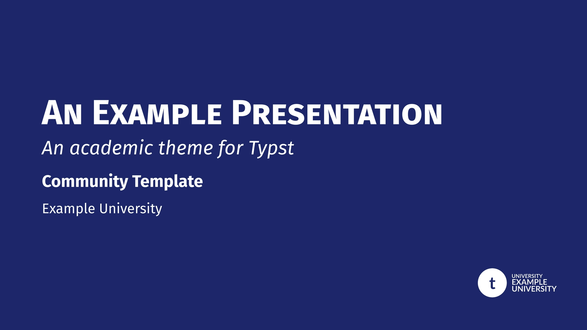
For Sorbonne University
#import "@preview/unofficial-sorbonne-presentation:0.5.0": sorbonne-template, slide

#show: sorbonne-template.with(
  title: [Academic Discovery],
  author: [John Doe],
  faculty: "sciences",
)

= Introduction
#slide[
  - High performance Typst engine
  #show: pause
  - Custom Sorbonne styling
]
For IPLESP
#import "@preview/unofficial-sorbonne-presentation:0.5.0": iplesp-template, slide

#show: iplesp-template.with(
  title: [Epidemiological Study],
  author: [Jane Smith],
  theme: "teal",
)

= Methodology
#slide[
  Research conducted at Laboratory...
]
For AP-HP
#import "@preview/unofficial-sorbonne-presentation:0.5.0": aphp-template, slide

#show: aphp-template.with(
  title: [Résultats de l'étude],
  title-line2: [Service d'épidémiologie],
  author: [Dr. Marie Dupont],
  affiliation: [AP-HP · Sorbonne Université],
  date: [Janvier 2026],
)

= Introduction
#slide[
  - Contexte et objectifs
  - Population étudiée
]
Documentation & Demo
The examples/demo.typ file is a comprehensive feature gallery and technical manual. The examples/demo-4-3.typ file shows a simple 4:3 layout for all three themes.
Both files use the --input flag to switch between themes:
# Full feature demo — Sorbonne (Light)
typst compile examples/demo.typ --input theme=sorbonne

# Full feature demo — IPLESP (Dark)
typst compile examples/demo.typ --input theme=iplesp --input dark=true

# Full feature demo — AP-HP
typst compile examples/demo.typ --input theme=aphp

# 4:3 layout demo — all three themes
typst compile examples/demo-4-3.typ --input theme=sorbonne
typst compile examples/demo-4-3.typ --input theme=iplesp
typst compile examples/demo-4-3.typ --input theme=aphp

# Handout version (static slides + notes)
typst compile examples/demo.typ --input handout=true
Available inputs for demo.typ:
theme:"sorbonne"(default),"iplesp", or"aphp".dark:"true"or"false"(default).handout:"true"or"false"(default).
Logo Customization
You can easily replace the institutional logos with your own by using the following parameters.
AP-HP Logo Slots
The AP-HP theme places two institutional logos at the bottom of every slide. Both can be replaced:
logo-left: Replaces the bottom-left logo (default: AP-HP / Sorbonne Université).logo-right: Replaces the bottom-right logo (default: AP-HP full logo).
Accepts a file path (string), any Typst content, or none (restores the default).
IPLESP Logo Slots
The IPLESP theme features a three-logo bar in the header. You can customize each slot individually:
logo-left/logo-left-transition: Replaces the Inserm logo.logo-center/logo-center-transition: Replaces the IPLESP logo.logo-right/logo-right-transition: Replaces the Sorbonne Health logo.
If you provide logo-slide, it will override the entire three-logo bar with a single centered logo.
logo-transition (Monochrome/White version)
Used on solid theme-colored backgrounds.
- Sorbonne: Title slide (bottom right), Transitions (top left), Focus & Ending slides.
- IPLESP: Title & Special slides (top right logo bar). Also used as fallback for
logo-left-transition, etc.
logo-slide (Color version)
Used on standard slides (white background).
- Sorbonne: Header next to title.
- IPLESP: Overrides the entire logo bar if provided. Otherwise, individual slots are used.
Configuration Reference
Common Parameters
| Parameter | Type | Default | Description |
|---|---|---|---|
title |
content | none |
Main presentation title |
short-title |
content | none |
Short version for footer |
subtitle |
content | none |
Optional subtitle |
author |
content | none |
Presenter’s name |
short-author |
content | none |
Short version for footer |
affiliation |
content | none |
Department or Laboratory |
date |
content | datetime... |
Custom date display |
math-font |
string/none | (see below) | Custom math font (set to none for default serif) |
dark-mode |
bool | false |
Enable dark theme for content slides |
handout |
bool | false |
Disable animations and enable physical notes pages |
aspect-ratio |
string | "16-9" |
"16-9" or "4-3" |
text-size |
length | 20pt |
Base text size |
show-outline |
bool | false |
Toggle summary slide |
mapping |
dict | (sec: 1, sub: 2) |
Logic mapping for headings |
progress-bar |
string | "none" |
Position: "none", "top", or "bottom" |
progress-bar-height |
length | 2pt |
Height of the progress bar |
title-smallcaps |
bool | true |
Apply smallcaps to slide header titles |
part-title |
content | [Part] |
Label for part transition slides |
appendix-title |
content | [Appendix] |
Label for individual appendix transition slides |
appendix-main-title |
content | [Appendices] |
Title of the focus slide introducing appendices |
appendix-numbering-format |
string | "I" |
Numbering style for appendices (e.g. "A", "I", "1") |
equation-definitions-width |
ratio | 85% |
Width of the equation definitions block |
transition-roadmap-width |
ratio | 60% |
Width of the roadmap in section transition slides |
Theme-Specific Parameters
- Sorbonne (
sorbonne-template):faculty:"univ","sante","sciences","lettres".text-font: Default"Fira Sans".math-font: Default"Fira Math".margin-top: Header height / top page margin. Default4.5em.footer-func: Custom footer function. Defaultbase-footer. Passnoneto disable.
- IPLESP (
iplesp-template):theme:"blue","red","yellow","green","teal","purple","orange","slate".text-font: Default"Lato".math-font: Default"Noto Sans Math".logo-left,logo-center,logo-right: Individual logo slots for the header bar.logo-left-transition,logo-center-transition,logo-right-transition: Monochrome versions for dark backgrounds.footer-func: Custom footer function. Defaultbase-footer. Passnoneto disable.
- AP-HP (
aphp-template):cover-style:"full"(default, navy right panel) or"light"(white background).classification: Content shown in a banner at the top in"light"mode (e.g.[C1 — Internal]). Defaultnone.title-line2: Optional second title line on the cover slide. When provided, the maintitleappears in a first block andtitle-line2in a second. Defaultnone.logo-left: Override for the bottom-left logo. Defaultnone(uses AP-HP / Sorbonne Université logo).logo-right: Override for the bottom-right logo. Defaultnone(uses AP-HP full logo).title-bg-light: Background color of the title slide. Defaultwhite.title-bg-dark: Background color of the title slide in dark mode. Defaultwhite.sidebar-align: Horizontal alignment of section/subsection titles in the left sidebar.left,center(default), orright. When set tocenterorright, level indents are automatically removed so all titles align consistently.text-font: Default("Open Sans", "Lato", "Fira Sans").math-font: Default"Noto Sans Math".
Component Reference
Illustrated with Sorbonne Theme.
Slide Types
#slide(title: none, subtitle: none, allow-slide-breaks: false, background: none, body): Standard content slide.
#focus-slide(body, subtitle: none): Highlight slide on solid theme background.
#figure-slide(fig, title: none, caption: none, ..): Centered figure slide.
#equation-slide(equation, title: none, definitions: none, citation: none, ..): Large equation with “signature”.
#acknowledgement-slide(people: (), institutions: (), ..): Thank-you slide.
#ending-slide(title: none, subtitle: none, contact: ()): Closing slide.
Text Helpers
#alert[text]: Highlighted bold text in primary color.#muted[text]: Gray secondary text.#subtle[text]: Light gray tertiary text.
Citations
- Inline and corner citations.
#cite-box("smith2023", position: "bottom-right")
Layout & Boxes
#two-col(left, right, columns: (1fr, 1fr)): Balanced columns.
#three-col(left, center, right): Three column layout.
#grid-2x2(tl, tr, bl, br): Four-quadrant grid layout.
- Boxes: All boxes support the
fill-modeparameter ("outline","fill","full").
#highlight-box(title, body): Blue university-styled box for key points.#alert-box(title, body): Red cautionary box for warnings.#example-box(title, body): Green academic box for examples.#algorithm-box(title, body): Monospace box for code/logic.#themed-block(title, body): Box automatically matching the theme color.
Handout Mode & Notes
This package provides a dedicated Handout Mode (handout: true) designed for printing or distributing a static version of your presentation.
- Animations Disabled: All dynamic content (
pause,uncover,only, etc.) is shown immediately on a single page per logical slide. - Physical Notes Pages: When
handoutis enabled, any content provided via the#note(body)function will be rendered on a new, dedicated page following the corresponding slide.
#slide(title: "My Slide")[
  Main content...

  #note[
    Additional details, references, or explanations
    that should only appear in the handout version.
  ]
]
Multiple calls to #note() within the same slide will be concatenated, separated by a paragraph break.
Credits
- Underlying Packages: Built with presentate and navigator.
- Inspiration: Layout features were inspired by the calmly-touying theme.
Changelog
v0.5.0
-
New parameter
raw-block-style(default:true, all three themes): Controls whether the theme wraps block code elements in a styled rectangle (gray background, border, rounded corners). Set tofalsewhen using an external tool such as Calepin that provides its own code block styling, to avoid a double rectangle around code chunks. -
New theme: AP-HP (
aphp-template): Institutional theme for AP-HP (Assistance Publique – Hôpitaux de Paris) presentations.cover-style: "full"(default) — navy right panel with title in blue blocks.cover-style: "light"— white background with optional classification banner (classificationparameter).title-line2— optional second line on the title cover.logo-left/logo-right— bottom logo overrides (accept path, content, ornone).title-bg-light/title-bg-dark— title slide background color (defaultwhite).sidebar-align— horizontal alignment of section/subsection titles in the left sidebar (left,center(default),right).
-
New demo
examples/demo-4-3.typ: Simple 4:3 showcase for all three themes, compiled via--input theme=sorbonne/iplesp/aphp. -
Config key homogenization across the three themes:
footer-funcexposed insorbonne-templateandiplesp-template(default:base-footer; passnoneto disable).margin-topexposed insorbonne-template(default:4.5em).title-bg-light/title-bg-darkadded to APHP conf and exposed as user-facing parameters.
v0.4.0
- Breaking — appendix parameters renamed:
annex-title,annex-main-title, andannex-numbering-formatare nowappendix-title,appendix-main-title, andappendix-numbering-format, matching the publicappendix()function. Default values changed from French ([Annexe]/[Annexes]) to English ([Appendix]/[Appendices]). - New parameter
title-smallcaps(default:true): Controls whether slide header titles are rendered in smallcaps. Set tofalseto preserve the original casing — useful for acronyms, proper nouns, or stylistic preference. - New parameter
part-title(default:[Part]): The label shown on part transition slides is now configurable. Previously hardcoded in French ("Partie"). - New parameter
progress-bar-height(default:2pt): Controls the height of the progress bar. - New parameter
equation-definitions-width(default:85%): Controls the width of the definitions block inequation-slide. - New parameter
transition-roadmap-width(default:60%): Controls the width of the roadmap block in section transition slides. - New parameter
code-font(default:("Fira Code", "DejaVu Sans Mono")): Specifies the monospace font used for code blocks and#algorithm-box. Can be overridden per-template call. - New parameter
fontinalgorithm-box(default:none, falls back to templatecode-font): Allows overriding the font for a specific algorithm box without changing the global template setting. - Automatic box title text color:
#highlight-box,#alert-box,#example-box, and#themed-blocknow automatically choose white or black title text based on the perceived luminance of the header background (ITU-R BT.601 coefficients), ensuring readability across all theme colors. - Bug fix — notes page titles: When a slide title comes from a heading (i.e. no explicit
title:argument to#slide()), the corresponding notes page in handout mode now displays the correct title instead of a blank one. - Bug fix — outline indentation: The outline indentation is now computed relative to the mapping’s minimum heading level, fixing misalignment when the mapping starts at a heading level greater than 1.
- Bug fix — footer page counter: The page number in the footer is now right-aligned without a fixed-width box, preventing clipping on high slide counts.
- Internal —
resolve-current-slide-meta(): Slide metadata resolution is now centralised in a single helper used by bothbase-headerandbase-footer, eliminating duplicated query logic.
v0.3.1
- Math Font Customization: Added
math-fontparameter to all templates. - Improved Math Rendering: Fixed a bug where math fonts would fallback to serif when bold weight was requested (e.g. in
equation-slide). - Standardized Defaults: Sorbonne defaults to
Fira Math, IPLESP defaults toNoto Sans Mathfor better visual consistency.
v0.3.0
- Native Handout Support: Integrated
presentate’s native handout mode. - Physical Notes: Added
#note()function to generate dedicated notes pages in handout mode. Successive calls to#note()are separated by paragraph breaks. - Outline Improvements:
- Hidden page numbers and fill by default for a cleaner presentation look.
- Automatic exclusion of appendix entries from the table of contents.
v0.2.0
- New template: the IPLESP template was added, with the same features than the already available Sorbonne template
- Dark mode: all themes of all templates has a new dark-mode parameter
v0.1.1
- Fix: Improved
max-lengthoption. It now automatically maps role names (part,section,subsection) to their corresponding heading levels for breadcrumb truncation. - Maintenance: Minor internal optimizations.
License
MIT License. See LICENSE for details.