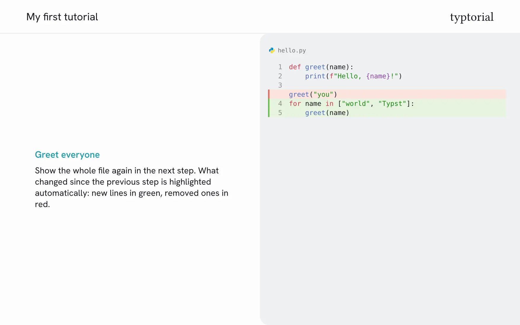

Step-by-step code tutorials with Typst. Every level-1 heading becomes a step with the explanation on the left and the code on the right. What changed in a file since the previous step is highlighted automatically.
The same source compiles to PDF slides and, with Typst’s experimental HTML export, to a single-page website.
Usage
#import "@preview/typtorial:0.1.0": tutorial

#show: tutorial.with(title: [My first tutorial])

= Say hello

First we print a greeting.

```python hello.py
print("Hello")
```

= Greet the world

Now we greet the whole world.

```python hello.py
print("Hello, world")
```
typst compile my-tutorial.typ
typst compile --features html --format html my-tutorial.typ
Or start from the bundled example with typst init @preview/typtorial.
Your own rules
Set and show rules work as usual when they come after #show: tutorial…, yet they only
affect the PDF: Typst’s HTML export carries structure, not text styling. Font sizes that
should apply to the website as well belong under sizes in the theme.
#show: tutorial.with(title: [My first tutorial])

#set par(justify: true)
#show heading.where(level: 1): it => text(size: 24pt, it)
Code blocks
- The word after the backticks is the language, an optional second word is the file
name:
```python src/main.py. - A block is compared with the last block of the same file name in an earlier step; blocks of the same step are never compared with each other. Blocks without a file name are compared by position: the first unnamed block of a step with the first of an earlier one. Added lines are marked green, removed lines red.
- Blocks are shown with line numbers and a file-type icon.
#diff-offshows the following blocks plainly,#diff-onresumes the comparison with the last block shown before. Import both next totutorial.diff: falsein the call switches the highlighting off for the whole tutorial.- Several blocks in one step are shown as tabs. In the PDF each tab gets its own page with the same explanation, and the tab bar marks which file is shown.
- In the PDF, code too long for one page continues on the next, split between lines. Text too long continues as well, split between paragraphs; the code stays next to it. On the website the code panel scrolls instead.
Options
| Parameter | Default | Meaning |
|---|---|---|
title |
none |
Title, shown on the title page and at the top left of every page |
abstract |
none |
Short summary shown before the first step |
lang |
"en" |
Language of the text; also sets the labels on the website |
mode |
"light" |
"light" or "dark"; color scheme of the PDF |
diff |
true |
Highlight what changed in a file since the previous step; false for unrelated excerpts |
show-removed |
true |
Keep removed code lines visible, highlighted in red |
logo, logo-dark |
none |
Image at the top right, e.g. image("logo.svg") |
favicon |
auto |
Icon of the website in the browser tab: the typtorial icon, none, or your own as read("icon.svg", encoding: none) (SVG, PNG or ICO) |
source, source-name |
none |
Text of the source file, offered as a download on the website |
theme |
(:) |
Fonts, colors, brand text and layout, see below |
fonts, sizes, colors, brand, layout, dark |
(:) |
Single theme settings given directly; they override theme |
Theme
A theme is a dictionary, usually loaded from a YAML file:
#show: tutorial.with(theme: yaml("my.theme.yaml"))
fonts:
  text: Helvetica Neue
sizes:
  text: 16
  heading: 20
colors:
  accent: "#239dad"
  heading: "#127885"
brand:
  text: My team
layout:
  title-page: true
  abstract: with-title
dark:
  colors:
    background: "#15141a"
Every setting can also be passed directly to the function, grouped like in the file. A value given this way overrides the one from the theme file:
#show: tutorial.with(
  theme: yaml("my.theme.yaml"),
  colors: (accent: "#d6336c"),
  layout: (dots: true, abstract: "separate"),
)
The package also ships four more themes:
themes.paper: warm paper tones, a serif text font and a yellow accentthemes.forest: sage tones, a deep green accent and a framed code panelthemes.indigo: a cool indigo gradient with progress dotsthemes.coral: warm peach tones, square corners and headings on a coral bar
| Theme | Light | Dark |
|---|---|---|
themes.default |
|
 |
themes.paper |
 |
 |
themes.forest |
 |
 |
themes.indigo |
 |
 |
themes.coral |
 |
 |
#import "@preview/typtorial:0.1.0": tutorial, themes

#show: tutorial.with(theme: themes.paper)
Only the settings you want to change are needed. All settings are listed with
comments in themes/default.theme.yaml; theme.schema.json describes
them for editors that support JSON Schema for YAML files.
A theme with its own colors gets a dark color scheme by adding a dark section. The
website then follows the reader’s system setting and offers a button to switch.
Website output
The website needs Typst’s HTML export, which is experimental: pass
--features html --format html and expect two warnings. Styles and script are embedded,
so the result is a single HTML file. Readers move one step forward or back with the
arrow keys ← and →.
Fonts
Typst only ships serif and monospace fonts, and a package cannot bring its own. Every font setting therefore accepts a list of fallbacks, and the first one that is installed is used:
fonts:
  text: [Hanken Grotesk, Helvetica Neue, Arial, Liberation Sans, DejaVu Sans]
The default theme looks best with
Hanken Grotesk,
a free font you can download from Google Fonts and install. Without it the next font of
the list is used: the bundled themes come with such lists, so the text is sans-serif on
macOS, Windows and Linux alike. Typst prints an unknown font family warning for every font of a list that is
not installed; the result is still correct.
themes.paper is built around
Source Serif 4, also free on Google
Fonts, and falls back to the serif fonts of the system without it.
On the website the browser picks from the same list among the fonts on the reader’s machine.
License
The package is licensed under the MIT license, see LICENSE. The files in template/
are licensed under MIT-0 instead: use and change them in your own project without
attribution.
Credits
The file-type icons in src/icons/ are from the
Material Icon Theme
(MIT license, see src/icons/LICENSE).