This is a Typst template specifically designed for presentations, especially suitable for academic reports and experimental displays. The template supports various page types including four-image layout, custom image positioning, and text-only pages.
Main Features
- Four-image layout: Allows up to 4 images per page, automatically divided into quadrants
- Flexible image control: Rich parameters to control image position, size, scaling, etc.
- Grid alignment control: New parameters for overall grid alignment, supporting nine alignment combinations
- Multiple page types: Title page, outline page, four-image page, custom layout page, text-only page
- Floating content box: Add customizable content boxes at any position on the page, supporting notes, tips, warnings, etc.
- Header and footer control: Independently control visibility; images automatically adapt to available space
- Responsive design: Images are center-aligned and scaled proportionally
- Professional appearance: 16:9 presentation ratio with clean headers and footers
Quick Start

1. Basic Configuration
#import "@preview/storytiles:0.0.1": *

#show: doc => ppt-conf(
  title: "My Presentation",
  author: "Author Name",
  theme: rgb("#1f4e79"),  // Theme color
  font-size: 12pt,
  doc
)
2. Create Title Page
#title-page(
  main-title: "Presentation Title",
  subtitle: "Subtitle",
  author: "Author",
  institution: "Institution Name",
  logo: "logo.png"  // Optional
)
3. Add Outline Page
#outline-page()
Page Types Explained
Four-image Page (four-image-page)
This is the core feature of the template, supporting the display of up to 4 images on one page.
#let img1 = image("img1.png")
#let img2 = image("img2.png")
#let img3 = image("img3.png")
#let img4 = image("img4.png")

#four-image-page(
  title: "Experimental Results",
  images: (img1, img2, img3, img4),
  captions: ("Caption 1", "Caption 2", "Caption 3", "Caption 4"),
  content: [Descriptive text for the page],
  image-height: 35%,
  image-width: 40%,
  gap: 1em,
  caption-size: 10pt,
  layout: "grid",
  grid-align-x: center,
  grid-align-y: center,
  show-header: true,
  show-footer: true,
)
Parameter Explanation:
images: Array of images, must be preloaded; supports 1-4 images, automatically leaves space for fewer than 4captions: Corresponding captions for each imagelayout:"grid"(default): 2×2 grid layout"linear": Vertical linear arrangement
image-height/image-width: Control image size, supports percentage and absolute valuesgap: Space between images- New
grid-align-x: Horizontal grid alignment (left,center,right) - New
grid-align-y: Vertical grid alignment (top,center,bottom) show-header/show-footer: Control header and footer visibility
Grid Alignment Example:
// Top-left grid alignment
#four-image-page(
  images: (img1, img2, img3, img4),
  grid-align-x: left,
  grid-align-y: top,
)
// Bottom-right grid alignment
#four-image-page(
  images: (img1, img2, img3, img4),
  grid-align-x: right,
  grid-align-y: bottom,
)
Header and Footer Control:
// Full-screen image mode
#four-image-page(
  images: (img1, img2, img3, img4),
  show-header: false,  // Hide header, images enlarge automatically
  show-footer: false,  // Hide footer, images enlarge automatically
)
Custom Layout Page (custom-layout-page)
Use this when you need precise control over image positioning:
#custom-layout-page(
  title: "Custom Layout",
  content: [Text content],
  images: (
    (
      path: "img1.png",
      x: 10%,
      y: 20%,
      width: 30%,
      height: 25%,
      caption: "Image 1"
    ),
    (
      path: "img2.png",
      x: 60%,
      y: 20%,
      width: 30%,
      caption: "Image 2"
    ),
  )
)
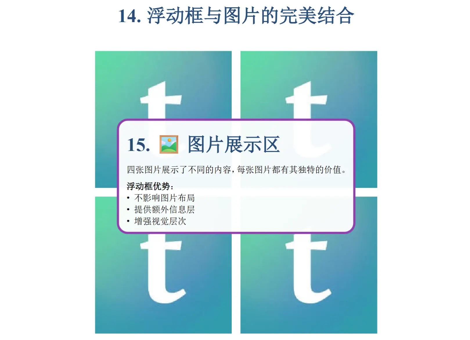
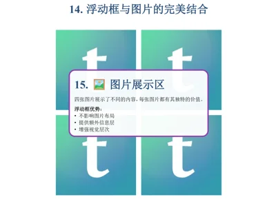
Floating Content Box (floating-box)
Add floating content boxes anywhere on the page, useful for notes, tips, warnings, etc.
#floating-box(
  [
    = Important Notice
    This is a floating content box!

    *Features*:
    - Can be placed anywhere
    - Supports semi-transparent background
    - Optional shadow effect
  ],
  x: 60%,
  y: 20%,
  width: 30%,
  height: auto,
  background: rgb(255, 255, 255, 200),
  border-color: rgb("#e74c3c"),
  border-width: 2pt,
  border-radius: 5pt,
  padding: 8pt,
  shadow: true,
)
Position Parameters:
- x: Horizontal position, 0% = left edge, 50% = center, 100% = right edge
- y: Vertical position, 0% = top edge, 50% = center, 100% = bottom edge Other Parameters:
- First parameter is the content of the box (position parameters)
width,height: Size of the box,heightdefaults toautoto fit contentbackground: Background color, supports transparency (4th parameter in rgb)border-*: Border style controlpadding: Spacing between content and bordershadow: Whether to show shadow effect Usage Scenarios:- 📝 Annotation Box: Add explanations for specific content
- ⚠️ Warning Box: Highlight important information or precautions
- 💡 Tip Box: Provide additional help information and suggestions
- 🎨 Decorative Box: Enhance visual effects and layering on the page
Text-only Page (text-page)
#text-page(
  title: "Theoretical Background",
  content: [
    = Level 1 Heading
    Paragraph content...

    == Level 2 Heading
    More content...
  ],
  column-count: 2  // Optional: display in columns
)
Floating Content Box (floating-box)
Add floating content boxes to the page, supporting various styles and precise positioning.
#floating-box(
  x: 70%,
  y: 15%,
  width: 25%,
  height: auto,
  content: [📌 Important Tip],
  fill: rgb("#e8f4fd"),
  stroke: rgb("#1f4e79"),
  radius: 8pt,
  inset: 8pt,
)
Position Parameters:
x,y: Absolute positioning relative to the top-left corner of the page (supports percentage and absolute values)width,height: Size of the box,height: autowill adjust based on content Style Parameters:fill: Background colorstroke: Border color and styleradius: Corner radiusinset: Spacing between content and border Preset Style Example:
// Warning Box
#floating-box(
  x: 5%, y: 60%,
  width: 35%,
  fill: rgb("#fff2cc"),
  stroke: rgb("#d6b656"),
  content: [⚠️ Important Notes...]
)
// Tip Box
#floating-box(
  x: 60%, y: 60%,
  width: 35%,
  fill: rgb("#e8f5e8"),
  stroke: rgb("#4caf50"),
  content: [💡 Useful Tips...]
)
// Decorative Box
#floating-box(
  x: 70%, y: 5%,
  width: 25%,
  fill: rgb("#f3e5f5"),
  stroke: rgb("#9c27b0"),
  content: [🎨 Design Highlights...]
)
Multiple Box Combination:
// Add multiple floating boxes on the same page
#floating-box(x: 5%, y: 20%, width: 40%, content: [Main Explanation])
#floating-box(x: 55%, y: 20%, width: 40%, content: [Supplementary Information])
#floating-box(x: 5%, y: 70%, width: 90%, content: [Summary Overview])
Image Handling Features
Automatic Scaling and Alignment
- All images are automatically center-aligned
- Maintain proportional scaling for both dimensions
- Vertically fill the specified area
- Use
fit: "contain"to ensure images are fully displayed
Supported Image Formats
- PNG, JPG, SVG and other common formats
- Vector graphics (SVG) provide the best display quality
Responsive Layout
- Image sizes automatically adapt to page dimensions
- Supports mixing percentage and absolute units
Style Customization
Theme Color Configuration
#show: doc => ppt-conf(
  theme: rgb("#1f4e79"),  // Deep blue
  // or
  theme: rgb("#8B0000"),  // Deep red
  doc
)
Font Configuration
The template defaults to using Times New Roman + SimSun combination, ensuring good display for both Chinese and English text.
Page Layout
- 16:9 presentation ratio
- Automatic headers and footers
- Page number display
Complete Example
Refer to the example.typ file for a complete usage example, including:
- Title page setup and presentation information
- Automatic outline generation
- Four-image page display (comparison of grid and linear layouts)
- Grid alignment control demonstration (nine alignment combinations)
- Header and footer control demonstration (full-screen mode)
- Custom layout page design
- Floating content box applications (annotation, warning, tip, decorative styles)
- Multiple floating box combination effects
- Text-only page layout (single and double columns)
- Best practices for image preloading demonstration
Technical Support
For issues or suggestions, please refer to the Typst official documentation or submit an issue.
(绝大多数内容都是ai写的,主要是为了应付组会上可能出现的大量图片展示) 这是一个专为演示文稿设计的 Typst 模板,特别适合学术报告和实验展示。模板支持四图片布局、自定义图片位置、文字页面等多种页面类型。
主要特性
- 四图片布局: 支持每页添加最多4个图片,自动四等分页面
- 灵活的图片控制: 提供丰富的参数来控制图片位置、大小、缩放等
- 网格对齐控制: 新增网格整体对齐参数,支持九种对齐方式组合
- 多种页面类型: 标题页、目录页、四图片页、自定义布局页、纯文字页
- 浮动内容框: 在页面任意位置添加可自定义的内容框,支持注释、提示、警告等
- 页眉页脚控制: 可独立控制页眉页脚显示,图片大小自动适应可用空间
- 响应式设计: 图片自动中心对齐,横纵等比例缩放
- 专业外观: 16:9 演示比例,美观的页眉页脚
快速开始
1. 基本配置
#import "@preview/storytiles:0.0.1": *

#show: doc => ppt-conf(
  title: "我的演示文稿",
  author: "作者姓名",
  theme: rgb("#1f4e79"),  // 主题色
  font-size: 12pt,
  doc
)
2. 创建标题页
#title-page(
  main-title: "演示文稿标题",
  subtitle: "副标题",
  author: "作者",
  institution: "机构名称",
  logo: "logo.png"  // 可选
)
3. 添加目录页
#outline-page()
页面类型详解
四图片页面 (four-image-page)
这是模板的核心功能,支持在一页中展示最多4张图片。
// 在主文件中预加载图片
#let img1 = image("img1.png")
#let img2 = image("img2.png")
#let img3 = image("img3.png")
#let img4 = image("img4.png")

#four-image-page(
  title: "实验结果",
  images: (img1, img2, img3, img4),
  captions: ("图1说明", "图2说明", "图3说明", "图4说明"),
  content: [页面的文字说明内容],
  // 可选参数
  image-height: 35%,        // 图片高度比例
  image-width: 40%,         // 图片宽度比例
  gap: 1em,                 // 图片间距
  caption-size: 10pt,       // 说明文字大小
  layout: "grid",           // "grid" 或 "linear"
  grid-align-x: center,     // 网格水平对齐:left, center, right
  grid-align-y: center,     // 网格垂直对齐:top, center, bottom
  show-header: true,        // 是否显示页眉
  show-footer: true,        // 是否显示页脚
)
参数说明:
images: 图片数组,必须是预加载的图片内容,支持1-4张图片,不足4张时自动留空captions: 对应每张图片的说明文字layout:"grid"(默认): 2×2网格布局"linear": 垂直线性排列
image-height/image-width: 控制图片大小,支持百分比和绝对值gap: 图片之间的间距- 新增
grid-align-x: 网格水平对齐 (left,center,right) - 新增
grid-align-y: 网格垂直对齐 (top,center,bottom) show-header/show-footer: 控制页眉页脚显示
网格对齐示例:
// 网格左上角对齐
#four-image-page(
  images: (img1, img2, img3, img4),
  grid-align-x: left,
  grid-align-y: top,
)

// 网格右下角对齐
#four-image-page(
  images: (img1, img2, img3, img4),
  grid-align-x: right,
  grid-align-y: bottom,
)
页眉页脚控制:
// 全屏图片模式
#four-image-page(
  images: (img1, img2, img3, img4),
  show-header: false,  // 隐藏页眉,图片自动放大
  show-footer: false,  // 隐藏页脚,图片自动放大
)
自定义布局页面 (custom-layout-page)
当你需要精确控制图片位置时使用:
#custom-layout-page(
  title: "自定义布局",
  content: [文字内容],
  images: (
    (
      path: "img1.png",
      x: 10%,           // x坐标
      y: 20%,           // y坐标
      width: 30%,       // 宽度
      height: 25%,      // 高度
      caption: "图1"    // 说明文字
    ),
    (
      path: "img2.png",
      x: 60%,
      y: 20%,
      width: 30%,
      caption: "图2"
    ),
  )
)
浮动内容框 (floating-box)
在页面的任意位置添加浮动的内容框,可以用于注释、提示、警告等:
#floating-box(
  [
    = 重要提示
    这是一个浮动的内容框!

    *特点*:
    - 可以放在任意位置
    - 支持半透明背景
    - 可选阴影效果
  ],
  x: 60%,                               // 水平位置:距页面左边60%
  y: 20%,                               // 垂直位置:距页面顶部20%
  width: 30%,                           // 框宽度
  height: auto,                         // 框高度(auto自适应)
  background: rgb(255, 255, 255, 200),  // 背景色(含透明度)
  border-color: rgb("#e74c3c"),         // 边框颜色
  border-width: 2pt,                    // 边框宽度
  border-radius: 5pt,                   // 圆角半径
  padding: 8pt,                         // 内边距
  shadow: true,                         // 是否显示阴影
)
位置参数说明:
- x: 水平位置,0% = 页面左边,50% = 页面中央,100% = 页面右边
- y: 垂直位置,0% = 页面顶部,50% = 页面中央,100% = 页面底部
其他参数:
- 第一个参数为框内内容(位置参数)
width,height: 框的尺寸,height默认为auto自适应内容background: 背景色,支持透明度(rgb第4个参数)border-*: 边框样式控制padding: 内容与边框的间距shadow: 是否显示阴影效果
使用场景:
- 📝 注释框: 为特定内容添加解释说明
- ⚠️ 警告框: 突出显示重要信息或注意事项
- 💡 提示框: 提供额外的帮助信息和建议
- 🎨 装饰框: 增强页面视觉效果和层次感
纯文字页面 (text-page)
#text-page(
  title: "理论背景",
  content: [
    = 一级标题
    段落内容...

    == 二级标题
    更多内容...
  ],
  column-count: 2  // 可选:分栏显示
)
浮动内容框 (floating-box)
为页面添加浮动的内容框,支持多种样式和精确定位。
#floating-box(
  x: 70%,           // 距离页面左边距离
  y: 15%,           // 距离页面顶部距离
  width: 25%,       // 框宽度
  height: auto,     // 框高度,auto为自动
  content: [📌 重要提示内容],
  // 样式参数
  fill: rgb("#e8f4fd"),           // 背景色
  stroke: rgb("#1f4e79"),         // 边框色
  radius: 8pt,                    // 圆角
  inset: 8pt,                     // 内边距
)
定位参数:
x,y: 绝对定位,相对于页面左上角的距离(支持百分比和绝对值)width,height: 框的尺寸,height: auto会根据内容自动调整
样式参数:
fill: 背景颜色stroke: 边框颜色和样式radius: 圆角半径inset: 内容与边框的间距
预设样式示例:
// 警告框
#floating-box(
  x: 5%, y: 60%,
  width: 35%,
  fill: rgb("#fff2cc"),
  stroke: rgb("#d6b656"),
  content: [⚠️ 注意事项...]
)

// 提示框
#floating-box(
  x: 60%, y: 60%,
  width: 35%,
  fill: rgb("#e8f5e8"),
  stroke: rgb("#4caf50"),
  content: [💡 实用技巧...]
)

// 装饰框
#floating-box(
  x: 70%, y: 5%,
  width: 25%,
  fill: rgb("#f3e5f5"),
  stroke: rgb("#9c27b0"),
  content: [🎨 设计亮点...]
)
多框组合:
// 在同一页面中添加多个浮动框
#floating-box(x: 5%, y: 20%, width: 40%, content: [主要说明])
#floating-box(x: 55%, y: 20%, width: 40%, content: [补充信息])
#floating-box(x: 5%, y: 70%, width: 90%, content: [总结概述])
图片处理特性
自动缩放和对齐
- 所有图片自动中心对齐
- 保持横纵等比例缩放
- 纵向填满指定区域
- 使用
fit: "contain"确保图片完整显示
支持的图片格式
- PNG, JPG, SVG 等常见格式
- 矢量图 (SVG) 获得最佳显示效果
响应式布局
- 图片大小自动适应页面尺寸
- 支持百分比和绝对单位混用
样式自定义
主题色配置
#show: doc => ppt-conf(
  theme: rgb("#1f4e79"),  // 深蓝色
  // 或者
  theme: rgb("#8B0000"),  // 深红色
  doc
)
字体配置
模板默认使用 Times New Roman + SimSun 组合,确保中英文显示效果。
页面布局
- 16:9 演示比例
- 自动页眉页脚
- 页码显示
完整示例
参考 example.typ 文件查看完整的使用示例,包含:
- 标题页设置与演示文稿信息
- 自动目录生成
- 四图片页面展示(网格和线性布局对比)
- 网格对齐控制演示(九种对齐方式)
- 页眉页脚控制演示(全屏模式)
- 自定义布局页面设计
- 浮动内容框应用(注释、警告、提示、装饰四种样式)
- 多浮动框组合效果展示
- 纯文字页面排版(单列和双列)
- 图片预加载最佳实践演示
技术支持
如有问题或建议,请参考 Typst 官方文档或提交 issue。