A Typst library for drawing graphs and plots. Made by Gewi413 and Pegacraffft
Currently supported graphs
-
Scatter plots
-
Graph charts
-
Histograms
-
Bar charts
-
Pie charts
-
Overlaying plots/charts
(more to come)
How to use
To use the package you can import it through this command import "@preview/plotst:0.2.0": *.
The documentation is found in the Docs.pdf file. It contains all functions necessary to use this library. It also includes a tutorial to create every available plot under their respective render methods.
If you need some example code, check out main.typ. It also includes a compiled version.
Examples:
All these images were created using the main.typ.
Scatter plots
// Plot 1:
// The data to be displayed
let gender_data = (
  ("w", 1), ("w", 3), ("w", 5), ("w", 4), ("m", 2), ("m", 2),
  ("m", 4), ("m", 6), ("d", 1), ("d", 9), ("d", 5), ("d", 8),
  ("d", 3), ("d", 1), (0, 11)
)

// Create the axes used for the chart
let y_axis = axis(min: 0, max: 11, step: 1, location: "left", helper_lines: true, invert_markings: false, title: "foo")
let x_axis = axis(values: ("", "m", "w", "d"), location: "bottom", helper_lines: true, invert_markings: false, title: "Gender")

// Combine the axes and the data and feed it to the plot render function.
let pl = plot(data: gender_data, axes: (x_axis, y_axis))
scatter_plot(pl, (100%,50%))

// Plot 2:
// Same as above
let data = (
  (0, 0), (2, 2), (3, 0), (4, 4), (5, 7), (6, 6), (7, 9), (8, 5), (9, 9), (10, 1)
)
let x_axis = axis(min: 0, max: 11, step: 2, location: "bottom")
let y_axis = axis(min: 0, max: 11, step: 2, location: "left", helper_lines: false)
let pl = plot(data: data, axes: (x_axis, y_axis))
scatter_plot(pl, (100%, 25%))
Graph charts
// The data to be displayed
let data = (
  (0, 0), (2, 2), (3, 0), (4, 4), (5, 7), (6, 6), (7, 9), (8, 5), (9, 9), (10, 1)
)

// Create the axes used for the chart
let x_axis = axis(min: 0, max: 11, step: 2, location: "bottom")
let y_axis = axis(min: 0, max: 11, step: 2, location: "left", helper_lines: false)

// Combine the axes and the data and feed it to the plot render function.
let pl = plot(data: data, axes: (x_axis, y_axis))
graph_plot(pl, (100%, 25%))
graph_plot(pl, (100%, 25%), rounding: 30%, caption: "Graph Plot with caption and rounding")
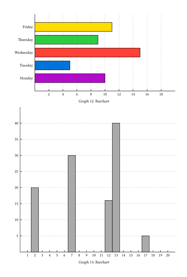
Histograms
// Plot 1:
// The data to be displayed
let data = (
  18000, 18000, 18000, 18000, 18000, 18000, 18000, 18000,
  18000, 18000, 28000, 28000, 28000, 28000, 28000, 28000,
  28000, 28000, 28000, 28000, 28000, 28000, 28000, 28000,
  28000, 28000, 28000, 28000, 28000, 28000, 28000, 28000,
  35000, 46000, 75000, 95000
)

// Classify the data
let classes = class_generator(10000, 50000, 4)
classes.push(class(50000, 100000))
classes = classify(data, classes)

// Create the axes used for the chart
let x_axis = axis(min: 0, max: 100000, step: 10000, location: "bottom")
let y_axis = axis(min: 0, max: 31, step: 5, location: "left", helper_lines: true)

// Combine the axes and the data and feed it to the plot render function.
let pl = plot(data: classes, axes: (x_axis, y_axis))
histogram(pl, (100%, 40%), stroke: black, fill: (purple, blue, red, green, yellow))

// Plot 2:
// Create the different classes
let classes = ()
classes.push(class(11, 13))
classes.push(class(13, 15))
classes.push(class(1, 6))
classes.push(class(6, 11))
classes.push(class(15, 30))

// Define the data to map
let data = ((20, 2), (30, 7), (16, 12), (40, 13), (5, 17))

// Create the axes
let x_axis = axis(min: 0, max: 31, step: 1, location: "bottom", show_markings: false)
let y_axis = axis(min: 0, max: 41, step: 5, location: "left", helper_lines: true)

// Classify the data
classes = classify(data, classes)

// Combine the axes and the data and feed it to the plot render function.
let pl = plot(axes: (x_axis, y_axis), data: classes)
histogram(pl, (100%, 40%))
Bar charts
// Plot 1:
// The data to be displayed
let data = ((10, "Monday"), (5, "Tuesday"), (15, "Wednesday"), (9, "Thursday"), (11, "Friday"))

// Create the necessary axes
let y_axis = axis(values: ("", "Monday", "Tuesday", "Wednesday", "Thursday", "Friday"), location: "left", show_markings: true)
let x_axis = axis(min: 0, max: 20, step: 2, location: "bottom", helper_lines: true)

// Combine the axes and the data and feed it to the plot render function.
let pl = plot(axes: (x_axis, y_axis), data: data)
bar_chart(pl, (100%, 33%), fill: (purple, blue, red, green, yellow), bar_width: 70%, rotated: true)

// Plot 2:
// Same as above, but with numbers as data
let data_2 = ((20, 2), (30, 7), (16, 12), (40, 13), (5, 17))
let y_axis_2 = axis(min: 0, max: 41, step: 5, location: "left", show_markings: true, helper_lines: true)
let x_axis_2 = axis(min: 0, max: 21, step: 1, location: "bottom")
let pl_2 = plot(axes: (x_axis_2, y_axis_2), data: data_2)
bar_chart(pl_2, (100%, 60%), bar_width: 100%)
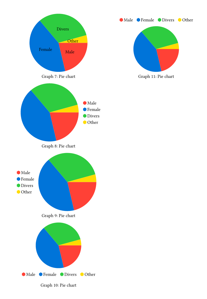
Pie charts
show: r => columns(2, r)

// create the sample data
let data = ((10, "Male"), (20, "Female"), (15, "Divers"), (2, "Other")

// Skip the axis step, as no axes are needed

// Put the data into a plot
let p = plot(data: data)

// Display the pie_charts in all different display ways
pie_chart(p, (100%, 20%), display_style: "legend-inside-chart")
pie_chart(p, (100%, 20%), display_style: "hor-chart-legend")
pie_chart(p, (100%, 20%), display_style: "hor-legend-chart")
pie_chart(p, (100%, 20%), display_style: "vert-chart-legend")
pie_chart(p, (100%, 20%), display_style: "vert-legend-chart")
Overlayed Graphs
// Create the data for the two plots to overlay
let data_scatter = (
  (0, 0), (2, 2), (3, 0), (4, 4), (5, 7), (6, 6), (7, 9), (8, 5), (9, 9), (10, 1)
)
let data_graph = (
  (0, 3), (1, 5), (2, 1), (3, 7), (4, 3), (5, 5), (6, 7),(7, 4),(11, 6)
)

// Create the axes for the overlay plot
let x_axis = axis(min: 0, max: 11, step: 2, location: "bottom")
let y_axis = axis(min: 0, max: 11, step: 2, location: "left", helper_lines: false)

// create a plot for each individual plot type and save the render call
let pl_scatter = plot(data: data_scatter, axes: (x_axis, y_axis))
let scatter_display = scatter_plot(pl_scatter, (100%, 25%), stroke: red)
let pl_graph = plot(data: data_graph, axes: (x_axis, y_axis))
let graph_display = graph_plot(pl_graph, (100%, 25%), stroke: blue)

// overlay the plots using the overlay function
overlay((scatter_display, graph_display), (100%, 25%))