Simple slides for your university presentations
Pepentation is a Typst template designed for clean, academic presentations.
Features:
- 🎨 Comprehensive Theming: Extensive theme system with preset themes and easy customization.
- 🧭 Navigation: Header with bullet-point progress tracker and interactive table of contents (Beamer-inspired).
- 🔢 Smart Layout: Automatic footer with 3-column layout (Authors, Title, Date/Page).
- 🧱 Rich Content Blocks: 9 styled block types for definitions, warnings, remarks, hints, info, examples, quotes, success, and failure messages.
- 🌈 Theme Presets: Multiple beautiful themes including light and dark variants.
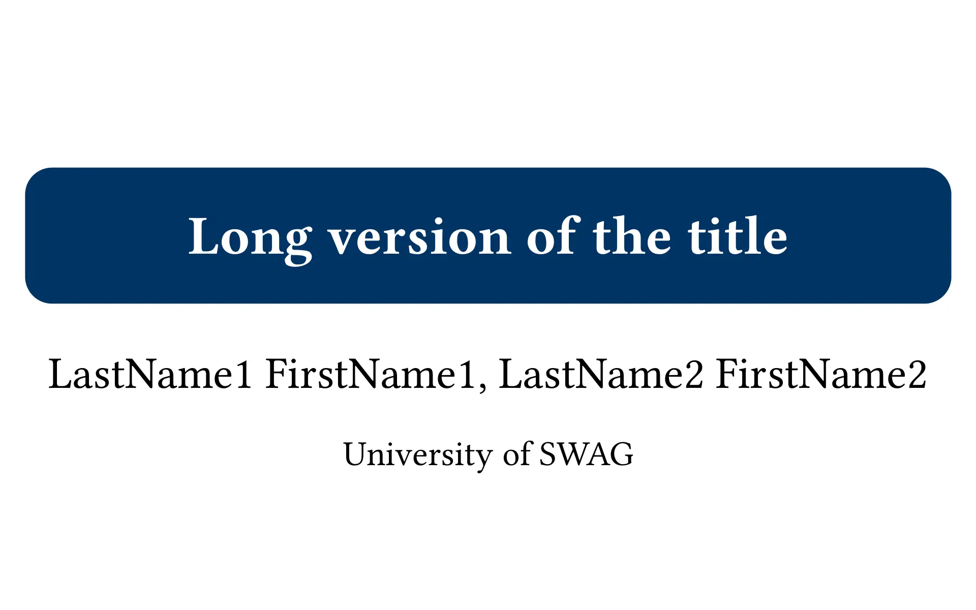
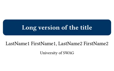
| Title Slide | Table of Contents | Section Slide | Main Slide |
|---|---|---|---|
 |
 |
 |
 |
Setup
Using the Published Package
Simply import the package in your .typ file:
#import "@preview/pepentation:0.2.0": *
The package will be automatically downloaded on first use.
Local Installation (Development)
If you want to install the package locally or modify it:
-
Clone or Download this repository.
-
Place it in your local Typst package directory:
{data-dir}/typst/packages/local/pepentation/0.2.0Where
{data-dir}is:- Linux:
$XDG_DATA_HOMEor~/.local/share - macOS:
~/Library/Application Support - Windows:
%APPDATA%
- Linux:
-
Import it in your
.typfile:#import "@local/pepentation:0.2.0": *
Quick Start
Don’t want to configure everything from scratch?
Check the template/ folder in this repository. It contains a fully configured main.typ file. You can copy this file to your project folder and start editing immediately.
Usage
Initialize the template at the top of your file using the setup-presentation rule:
#import "@preview/pepentation:0.2.0": *

#show: setup-presentation.with(
  title-slide: (
    enable: true,
    title: "Presentation Title",
    authors: ("Author One", "Author Two"),
    institute: "University of Typst",
  ),
  footer: (
    enable: true,
    title: "Short Title",
    institute: "Short Inst.",
    authors: ("A. One", "A. Two"),
  ),
  table-of-contents: "detailed", // Interactive: click to jump to section
  header: true,
  locale: "EN"
)

// Your content goes here...
Structure
Use standard markdown-like headings to structure your slides:
= Section(Level 1): Creates a dedicated Section Title Slide.== Slide Title(Level 2): Creates a new Main Slide.==(Empty Level 2): Creates a new slide without a title (excluded from ToC).=== Subsection(Level 3): Creates a new slide with a title, but excluded from the Table of Contents.
= Introduction

== Motivation
This is the first slide of the introduction.

==
This slide has no title.

=== Detail View
This slide has a title, but won't appear in the outline.
Table of Contents Styles
Pepentation offers two different styles for the table of contents:
-
"detailed"(default): A compact 3-column layout that includes both section titles and subsections. This style displays level 1 headings with slide numbers and includes level 2 subheadings in a multi-column format for efficient space usage. -
"simple": A clean 2-column grid layout displaying only section titles (level 1 headings) in styled boxes. This provides a simpler, more spacious overview of your presentation structure. -
"none": Disables the table of contents entirely.
Content Blocks
The template provides 9 styled blocks for highlighting specific content:
#definition[content](Gray) - Definitions, theorems, important concepts#warning[content](Red) - Warnings, cautions, important notices#remark[content](Orange) - Remarks, notes, additional observations#hint[content](Green) - Hints, tips, helpful suggestions#info[content](Blue) - Informational content, facts, details#example[content](Purple) - Examples, demonstrations, sample code#quote[content](Neutral Gray) - Quotations, citations, referenced text#success[content](Green) - Success messages, achievements, positive results#failure[content](Red) - Failure messages, errors, issues
Example:
#definition[
  *Euclid's Algorithm*
  An efficient method for computing the GCD.
]

#info[
  *Information – Time Complexity*
  The algorithm runs in `O(n log n)` time.
]

#example[
  *Example – Usage*
  ```python
  result = gcd(48, 18)
  # Returns: 6
  ```
]

#success[
  *Success – Implementation Complete*
  All test cases pass!
]
Theming System
Pepentation features a comprehensive theming system that allows you to customize colors for all elements, including blocks and inline code.
Using Theme Presets
Import the themes module and use a preset theme:
#import "@preview/pepentation:0.2.0": *

#show: setup-presentation.with(
  theme: themes.theme-azure-breeze,
  // ... other options
)
Available Theme Presets
theme-azure-breeze/theme-azure-breeze-dark- Light blue theme with fresh, airy feeltheme-crimson-dawn/theme-crimson-dawn-dark- Red-based theme with warm, energetic tonestheme-forest-canopy/theme-forest-canopy-dark- Green-based theme with natural, calming tonestheme-deep-ocean/theme-deep-ocean-dark- Blue-based theme (enhanced default)theme-twilight-violet/theme-twilight-violet-dark- Purple-based theme with elegant, mysterious tonestheme-golden-hour/theme-golden-hour-dark- Warm, sunset-inspired theme with golden and amber tonestheme-emerald-glow/theme-emerald-glow-dark- Vibrant green theme with emerald accents
Customizing Themes
You can easily customize any theme by merging it with your own values:
#import "@preview/pepentation:0.2.0": *

#show: setup-presentation.with(
  theme: (
    ..themes.theme-azure-breeze,
    primary: rgb("#FF0000"),  // Override primary color
    blocks: (
      ..themes.theme-azure-breeze.blocks,
      definition-color: rgb("#888888"),  // Override block color
    ),
  ),
)
Creating Custom Themes
You can create your own theme by defining a dictionary with all theme properties:
#let my-custom-theme = (
  primary: rgb("#003365"),
  secondary: rgb("#00649F"),
  background: rgb("#FFFFFF"),
  main-text: rgb("#000000"),
  sub-text: rgb("#FFFFFF"),
  sub-text-dimmed: rgb("#FFFFFF"),
  code-background: luma(240),
  code-text: none,
  blocks: (
    definition-color: gray,
    warning-color: red,
    remark-color: orange,
    hint-color: green,
    info-color: blue,
    example-color: purple,
    quote-color: luma(200),
    success-color: rgb("#22c55e"),
    failure-color: rgb("#ef4444"),
  ),
)

#show: setup-presentation.with(
  theme: my-custom-theme,
)
Configuration Options
These are the parameters available in the setup-presentation function:
| Keyword | Description | Default |
|---|---|---|
title-slide |
Dictionary configuration for the title slide | (enable: false) |
title-slide.enable |
Whether to show title slide | false |
title-slide.title |
Full title displayed on title page | none |
title-slide.authors |
Array of author names | () |
title-slide.institute |
Institute name | none |
footer |
Dictionary configuration for the footer | (enable: false) |
footer.enable |
Whether to show footer | false |
footer.title |
Short title displayed in center of footer | none |
footer.authors |
Array of short author names (left side) | () |
footer.institute |
Short institute name (left side) | none |
footer.date |
Date displayed (right side) | Today |
theme |
Dictionary for colors | (See Theme System above) |
theme.primary |
Primary brand color (Header/Footer/Title) | rgb("#003365") |
theme.secondary |
Secondary accents | rgb("#00649F") |
theme.background |
Slide background color | rgb("#FFFFFF") |
theme.main-text |
Body text color | rgb("#000000") |
theme.sub-text |
Text color on dark backgrounds (headers) | rgb("#FFFFFF") |
theme.sub-text-dimmed |
Dimmed text color | rgb("#FFFFFF") |
theme.code-background |
Background color for inline code | luma(240) |
theme.code-text |
Text color for inline code (optional) | none |
theme.blocks |
Dictionary of block colors | (See default-theme) |
theme.blocks.definition-color |
Color for definition blocks | gray |
theme.blocks.warning-color |
Color for warning blocks | red |
theme.blocks.remark-color |
Color for remark blocks | orange |
theme.blocks.hint-color |
Color for hint blocks | green |
theme.blocks.info-color |
Color for info blocks | blue |
theme.blocks.example-color |
Color for example blocks | purple |
theme.blocks.quote-color |
Color for quote blocks | luma(200) |
theme.blocks.success-color |
Color for success blocks | rgb("#22c55e") |
theme.blocks.failure-color |
Color for failure blocks | rgb("#ef4444") |
table-of-contents |
Style for the table of contents ("none", "detailed", "simple") |
"detailed" |
header |
Show the navigation header | true |
locale |
Language (“EN” or “RU”) | "EN" |
height |
Slide height (aspect ratio fixed at 16:10) | 12cm |