A reusable Touying component
library for slides that look like a rendered GitHub README. Light and
dark themes, six accent colors, two density presets — all switched at
register-time. Single-file, no extra dependencies beyond @preview/touying.
 |
 |
 |
 |
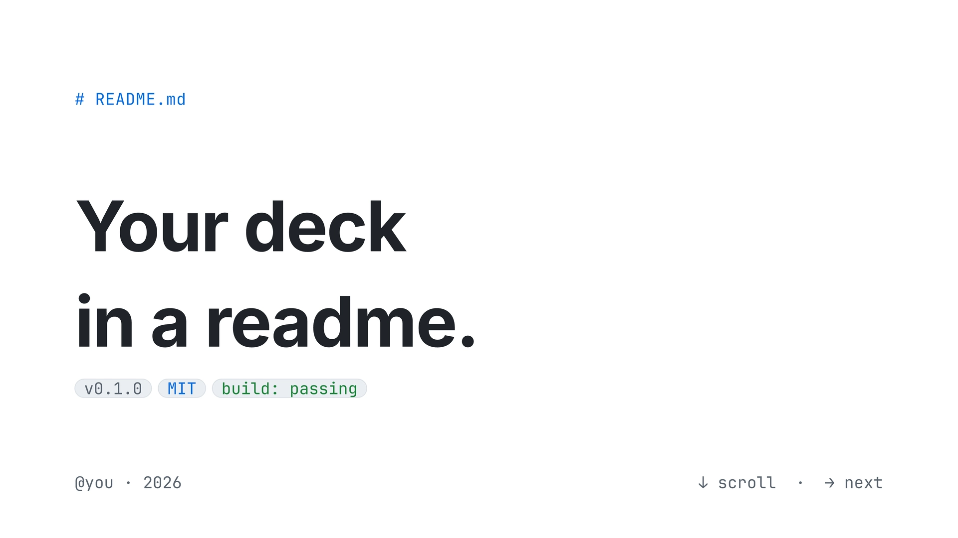
Light theme, blue accent, comfy density. The full 13-slide deck is in example.pdf (source: example.typ).
Install
From Typst Universe:
#import "@preview/touying:0.7.3": *
#import "@preview/gh-minimal-slides:0.1.0" as gh
Or scaffold a starter deck:
typst init @preview/gh-minimal-slides:0.1.0 my-deck
cd my-deck
typst compile main.typ
Quick start
#import "@preview/touying:0.7.3": *
#import "@preview/gh-minimal-slides:0.1.0" as gh

#show: gh.register.with(
  theme:   "light",   // "light" | "dark"
  accent:  "blue",    // "blue" | "green" | "purple" | "pink" | "orange" | "mono"
  density: "comfy",   // "comfy" | "compact"
)

#gh.cover-slide(
  title: [A minimal\ readme-style\ slide gallery.],
  badges: ("v1.0.0", ("MIT license", "accent"), ("build: passing", "success"), "docs"),
)

#gh.content-slide(title: [Unordered list])[
- Mix freely with prose, like `npm install`.
- Links inherit the accent color — #gh.gh-link[see reference →]
]

#gh.content-slide(title: [Numbered list])[
+ Use Typst's native enum syntax.
+ Keep slide helpers for layout, not for basic Markdown-like markup.
]
See example.typ for a complete 13-slide deck showing the
common components. The compiled example.pdf shows the full
preview.
API
Slide functions
| Function | Required args | Notes |
|---|---|---|
cover-slide |
title: |
Optional kicker:, badges:, footer-left:, footer-right:. Badges accept strings or (text, kind) tuples where kind is "default" / "accent" / "success". |
section-slide |
number:, title: |
Optional kicker: (default "Chapter"). |
content-slide |
title:, body block |
Preferred text slide. Use normal Typst markup, including - bullets, + numbered lists, and fenced code blocks. Accepts animation: true for top-level bullet reveals, or repeat: plus a callback body for custom Touying animations. |
bullet-slide |
title:, items: |
Deprecated legacy helper. Use content-slide with callback-style animation instead. |
ordered-slide |
title:, items: |
Legacy helper for accent-numbered tuple items or incremental reveals. Prefer content-slide with + lists for ordinary numbered content. |
quote-slide |
body: |
Optional title:, attribution:. |
code-slide |
lines: |
Deprecated legacy helper. Prefer fenced code blocks inside content-slide. |
table-slide |
headers:, rows: |
Optional title:, columns:, value-colors:, animation:. method-colors: is a deprecated alias for value-colors:. |
two-col-slide |
left:, right: |
Each side is (kicker, color, stat, body). color is "success", "warning", "danger", "accent", or any rgb(...). |
image-slide |
body: or placeholder-text: |
Pass body: image("path.png") or rely on the placeholder block. Caption supports gh-link. |
stats-slide |
stats: |
Each stat is (value, label, delta). Renders as a 2-column grid. |
task-slide |
tasks: |
Each task is (done, label, meta). Done tasks get a strike-through and green checkbox. |
alert-slide |
alerts: |
Each alert is (kind, color, body). kind like "NOTE", "TIP", "WARNING", "CAUTION". |
closing-slide |
title: |
Optional kicker:, links:. |
Every chromed slide function also accepts n: and total: for the
counter, but they default to Touying’s inferred slide numbers. Do not pass
them in normal decks.
Animations
Use animation: true in content-slide for ordinary top-level bullet reveals:
#gh.content-slide(title: [Example], animation: true)[
  - First point
  - Second point
  - Third point
]
Use Touying’s callback-style animation when a slide needs custom timing:
#gh.content-slide(title: [Example], repeat: 2, self => [
  #let (uncover, only, alternatives) = utils.methods(self)

  - First point
  #uncover("2-")[- Second point]
])
Prefer this over #pause inside content-slide; the theme uses Typst
context blocks for live styling, and raw pause markers are not supported
inside that context.
table-slide(animation: true) reveals table rows one at a time while keeping
the header visible:
#gh.table-slide(
  title: [Example],
  headers: ("Name", "Role"),
  rows: (
    ("Claude", "coding agent"),
    ("Codex", "coding agent"),
  ),
  animation: true,
)
Building blocks (call directly inside slide bodies or anywhere)
| Function | Use |
|---|---|
`code` |
Preferred inline code syntax. Backticks are styled as pill-shaped inline code. |
| fenced code blocks | Preferred code block syntax. Triple-backtick blocks render with terminal chrome and Typst’s native syntax highlighting. |
code-inline(body) |
Direct helper behind the backtick styling; kept for custom composition. |
terminal-block(title:, lang:, prompt:, lines:, body:) |
Lower-level compact terminal block. Use fenced blocks for code; use terminal-block for prompts/output like /context, or when you need a custom title. Line numbers are opt-in with line-numbers: true. |
code-block(filename:, lang:, lines:) |
Deprecated compatibility wrapper around terminal-block. |
gh-link(body) |
Accent-colored span. No underline. |
c-keyword, c-string, c-number, c-comment |
Syntax-color helpers for use inside terminal-block lines. |
Tokens (read directly if you want to compose your own widgets)
gh-light,gh-dark— palette dictionaries:bg-canvas,bg-canvas-subtle,bg-neutral-muted,fg-default,fg-muted,fg-subtle,border-default,border-muted,success,warning,danger.gh-accents— six entries (blue,green,purple,pink,orange,mono), each with(light, dark)variants.
Design rules
These are encoded in code as well, but worth knowing when authoring decks:
- One accent per deck. Picked at register-time. Slide functions
read it — they don’t take an
accent:arg. (If you want per-section accents, seeterminal-fancy/instead.) - Light vs dark are full re-skins, also chosen at register-time. Dark mode swaps every palette token; the same source compiles in both.
- Status colors (
success/warning/danger) are reserved for semantics — HTTP method colors, alert kinds, deltas. They are not configurable. - Slide numbers are inferred. Only override
n:/total:for unusual appendix or export cases.
Customizing
Three patterns, in order of effort:
- Switch theme/accent/density. Change the
register.with(...)call. Every slide re-skins. - Use the building blocks outside a slide.
code-inline,terminal-block,gh-link, andc-*syntax helpers are all callable from any context — useful for inline content inside other components (e.g. linking from a caption, embedding code in a quote attribution). - Write a custom slide. Wrap your body in
touying-slide-wrapper(self => touying-slide(self: self, context { let ctx = gh._gh-state.get(); ... }))and usectx.palette/ctx.accent/ctx.ts/ctx.spto honor the active theme. The internal helpers (_h1,_h2,_breadcrumb,_pill,_frame) are available too.
Fonts
- Inter — sans (body, headings).
- JetBrains Mono — mono (code, breadcrumbs, badges, metadata).
The CSS source uses -apple-system, BlinkMacSystemFont, ... for sans
and ui-monospace, "SF Mono", ... for mono — neither installable as a
font file. Inter + JetBrains Mono are the closest cross-platform
substitutes and are already used by the sibling terminal-fancy theme.
If you don’t have them locally:
brew install --cask font-inter font-jetbrains-mono
Fallbacks (Helvetica Neue, SF Mono, Menlo, Consolas) keep the
warning noise down on machines without those fonts.
License
Adapted from a GitHub-readme-style React reference deck. Free to use and modify.